Logo
Our logo is our most valuable brand asset and should represent Xfinity in all communications. Whether it’s black or white, static or animated, it’s always an essential element of our story.
Download LogosPrimary Use
Use the black or white version of the Xfinity logo for Xfinity communications and product experiences.


Limited Use
The red Xfinity logo is reserved for high impact use in environmental applications.

Future of Awesome
The Xfinity Future of Awesome logo is reserved for strategic, high-visibility communications. Only use this version of the logo when the tagline has legibility and impact.


Logo in Motion
Our animated logo is reserved for Xfinity TV spots and video tactics. The white Xfinity logo on a dark background ensures optimal legibility, consistency and impact.
Logo Misuses
-
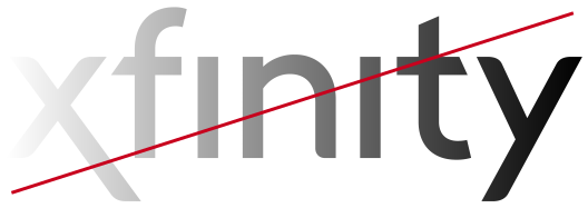
Do not recolor or add gradients to our logo.
-
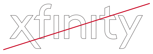
Do not manipulate the logo.
-
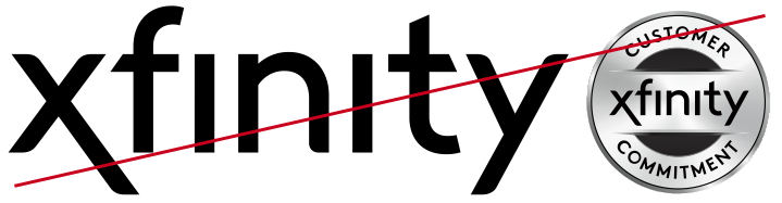
Do not lock up with other graphic elements.
Brand Symbol
Our brand symbol X is our most differentiated and distinctive feature of our name and identity. It’s used to signal our brand and celebrate our brand vision. To build meaning into our brand symbol, we use it selectively and strategically for the greatest impact. Please contact the Brand Team for approval.
The Xfinity X
Use the black or white version of our Brand Symbol depending on background contrast.


Functional
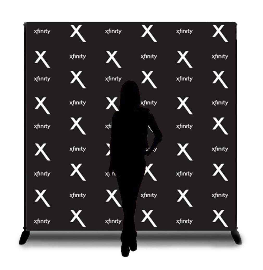
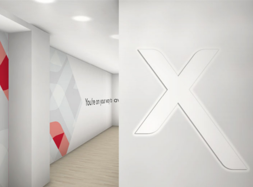
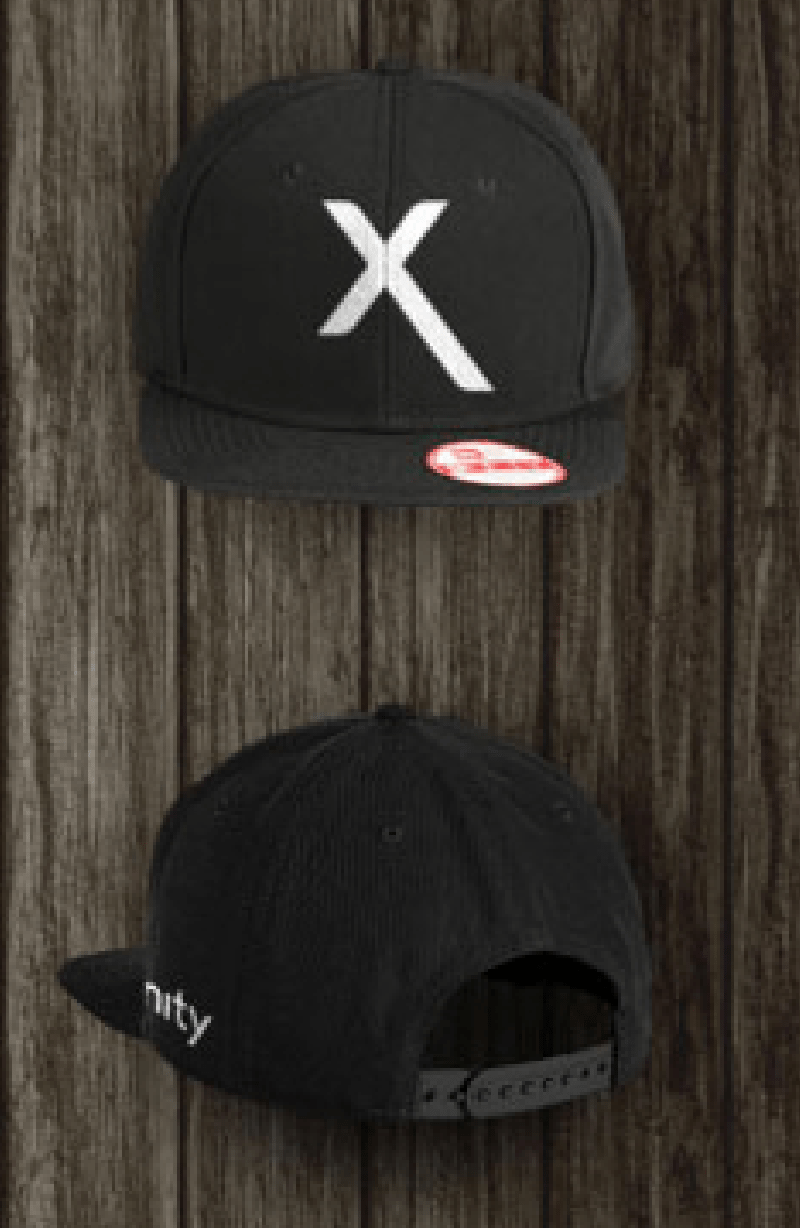
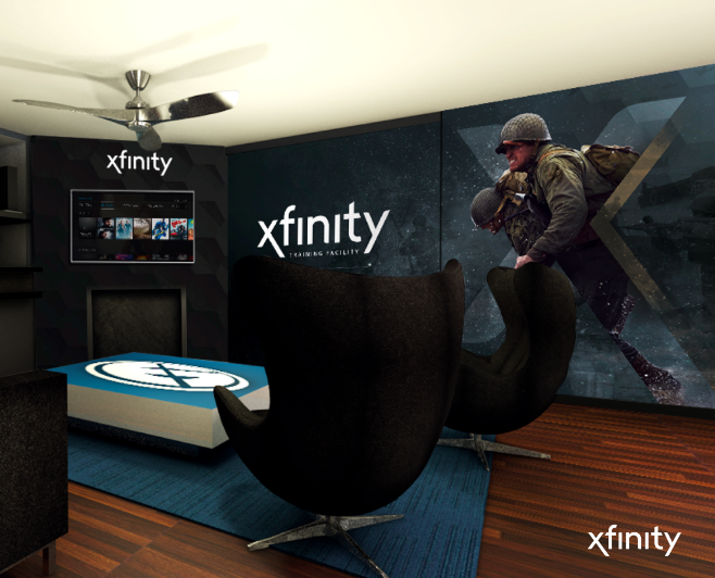
Our X can be used as a shorthand for Xfinity in environments where the brand has already been established. It complements other brand elements in experiential activations.
Expressive
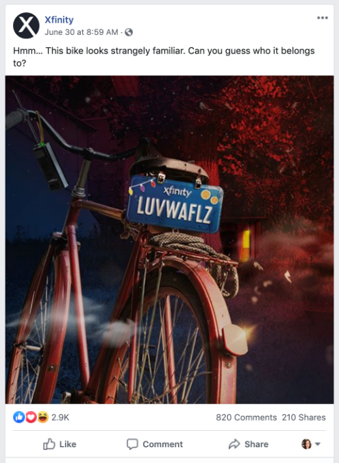
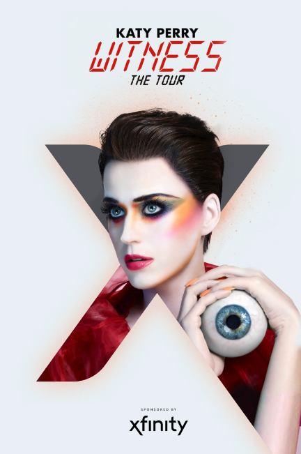
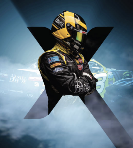
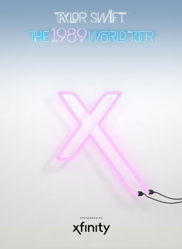
Our X can also be used as a storytelling device to celebrate our passions and products. We use our brand symbol to tell stories around our unique perspective on a topic, event, or partnership.
Brand Symbol Misuses
-

Do not recolor, especially in red.
-
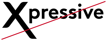
Do not use as a replacement for the letter X or lock up with text.
-

Do not warp.
Sub-Brands
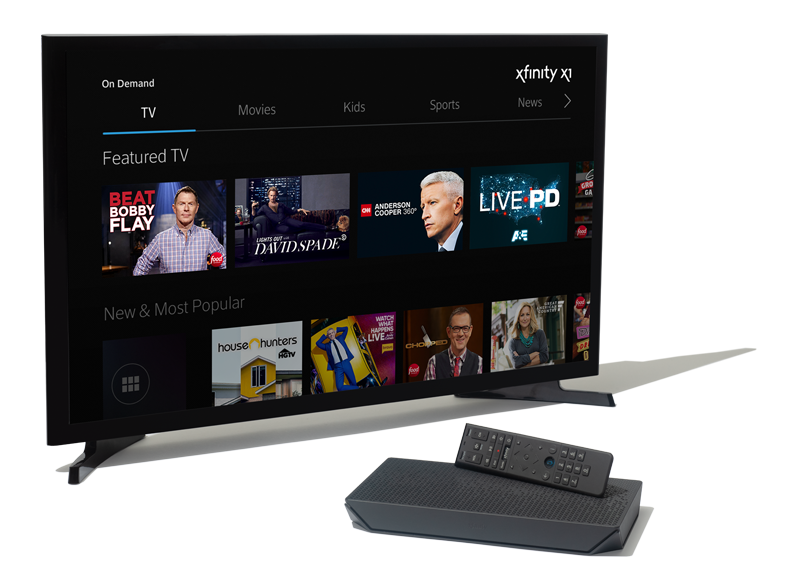
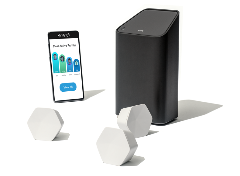
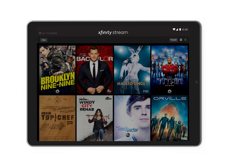
Our masterbrand strategy includes products, features and benefits that support Xfinity. Sub-Brand logos have been designed for strategically significant experiences, particularly for dedicated product experiences such as apps. The primary Xfinity logo should be used in the majority of communications.
Download Sub-Brand Logos






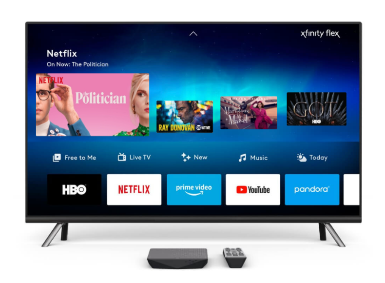
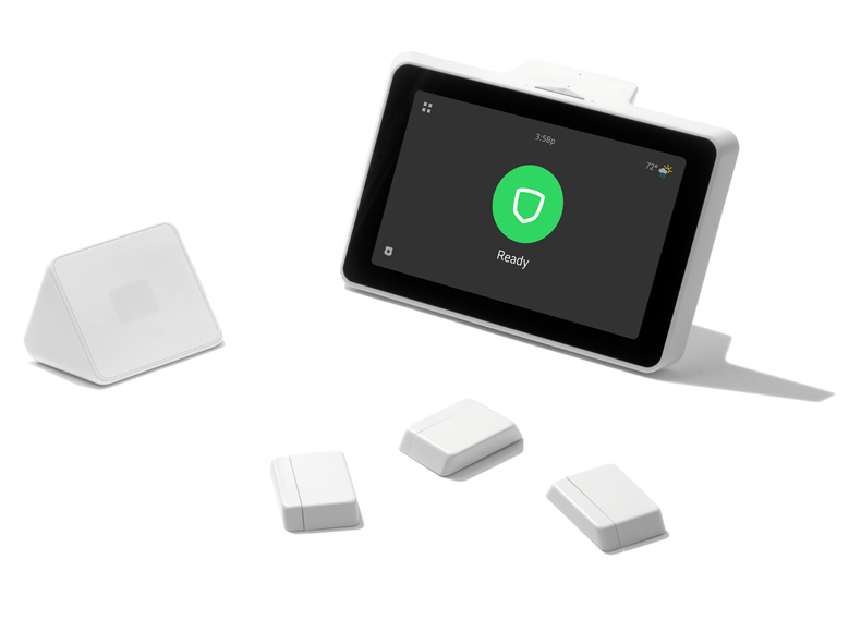
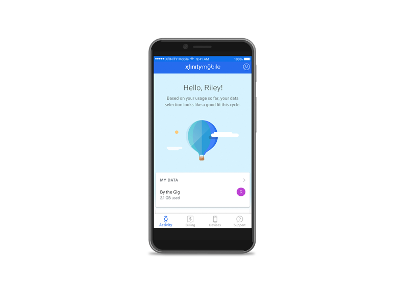
Sub-Brand Misuses
-
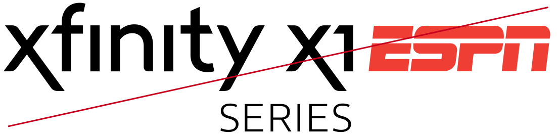
Do not use sub-brand logos to create third-party lock-ups.
-

Do not recolor sub-brand logos.
-

Do not use sub-brand logos with feature names.
Color
Xfinity embraces a neutral color palette, which allows our products and photography to shine.
To stay true to our roots, we’ll occasionally use a pop of red to show our personality and highlight important information.
Action blue is used exclusively for calls-to-action in digital experiences.
Download Color PaletteColor Palette
White
- CMYK 0/0/0/0
- RGB 255/255/255
- HEX #FFFFFF
Black
- CMYK 0/0/0/100
- RGB 0/0/0
- HEX #000000
Xfinity Cool Gray
- CMYK 7/4/3/8
- RGB 235/237/239
- HEX #EBEEF0
Xfinity Dark Gray
- CMYK 63/56/52/27
- RGB 90/90/92
- HEX #5A5A5C
Xfinity Accent Red
- CMYK 0/100/100/10
- RGB 200/0/29
- HEX #C8001D
Xfinity Action Blue
- CMYK 86/8/0/0
- RGB 43/156/216
- HEX #2B9CD8
Color Misuses
-
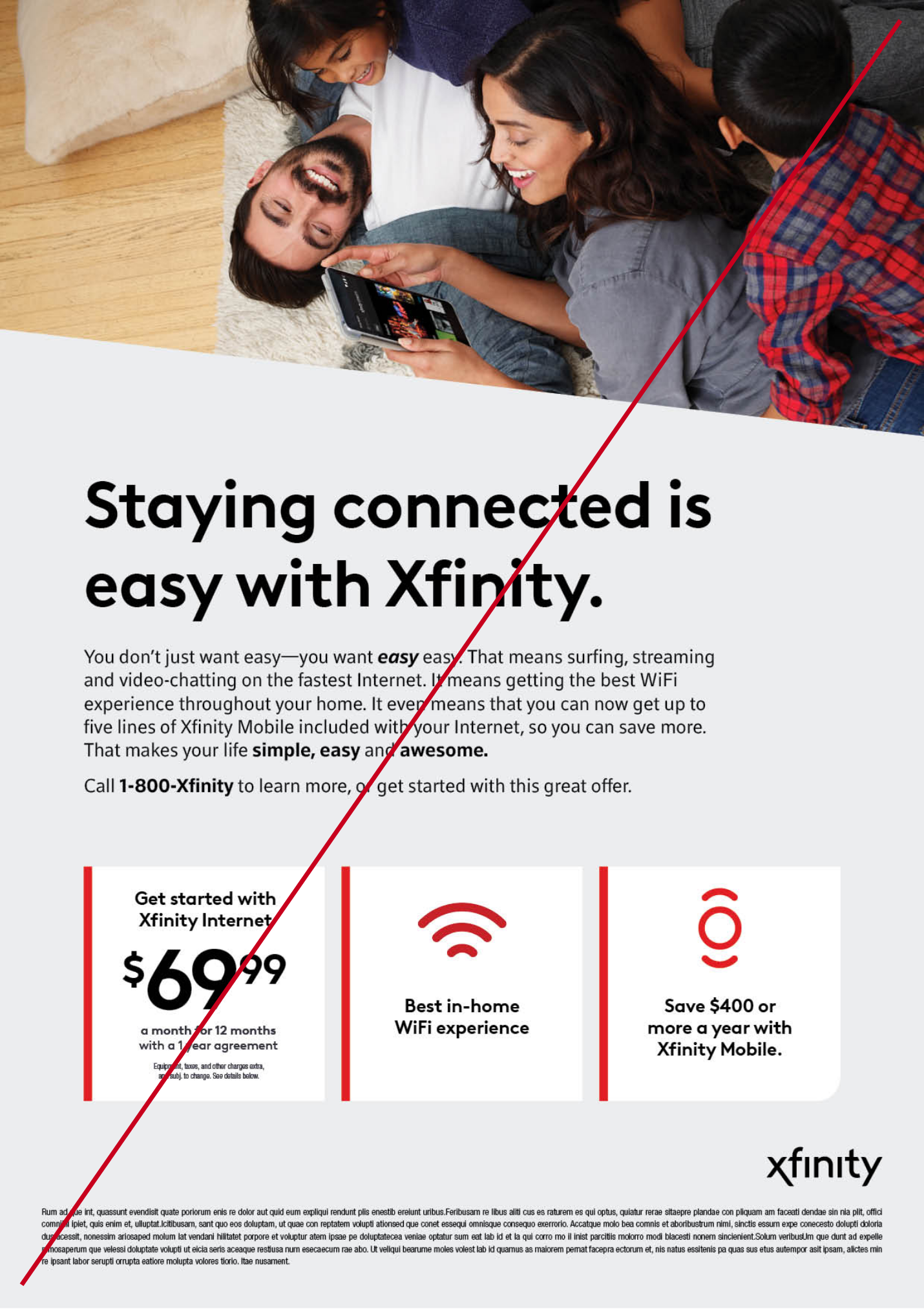
Do not overuse red or recolor icons.
-
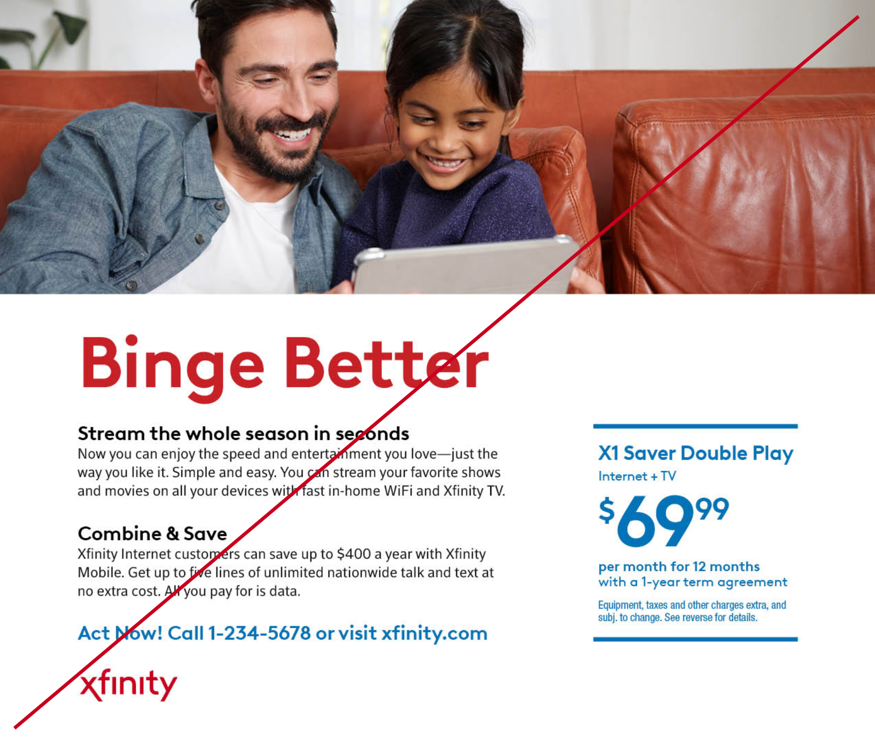
Do not use red or blue in headlines or subheads. Do not use the limited use red logo in communications.
-
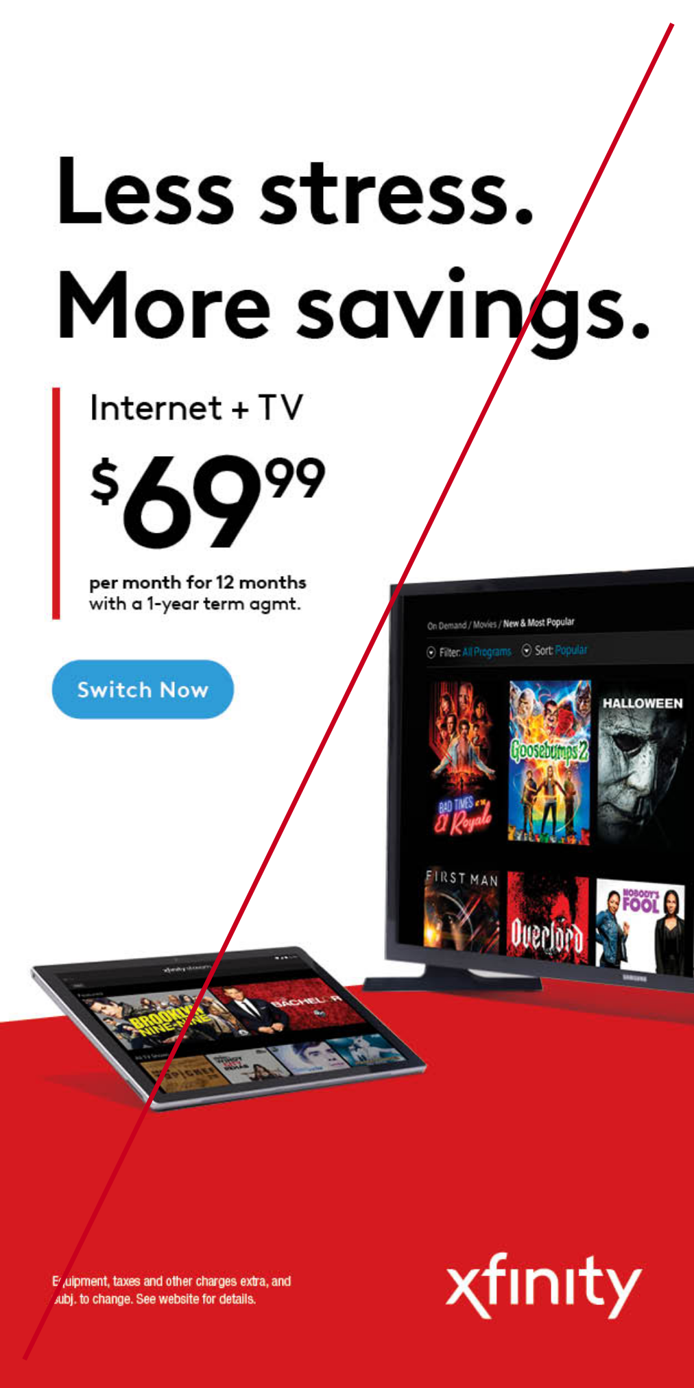
Do not use red in full bleed or as a background color.
Typography
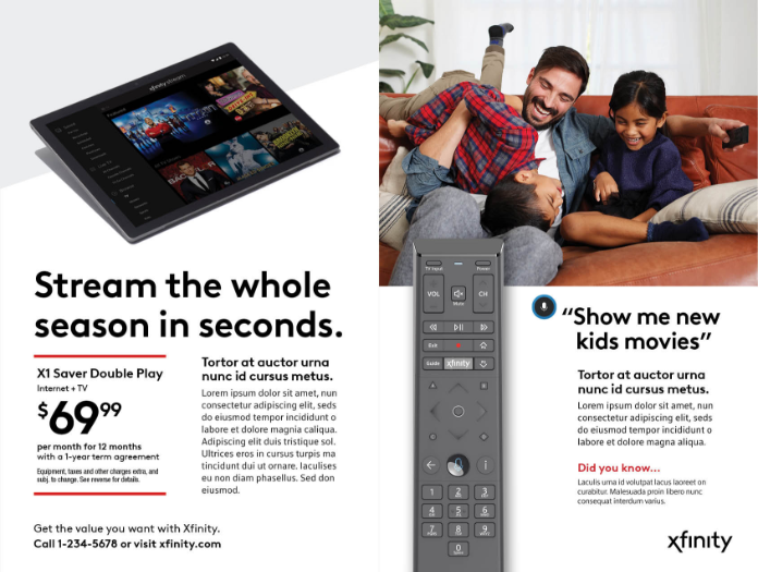
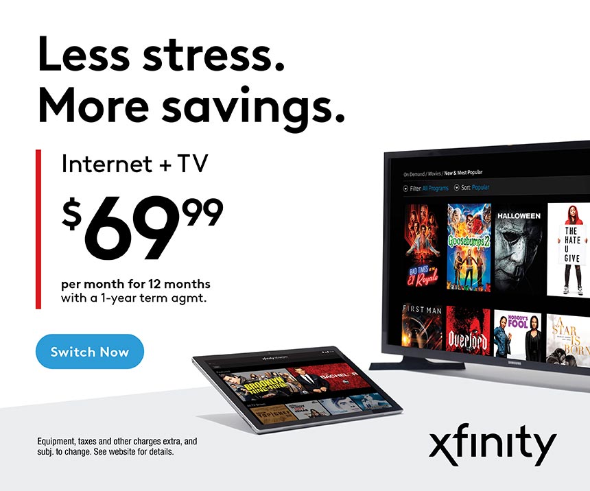
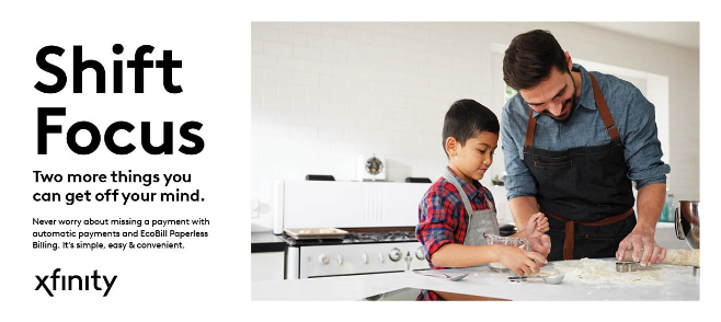
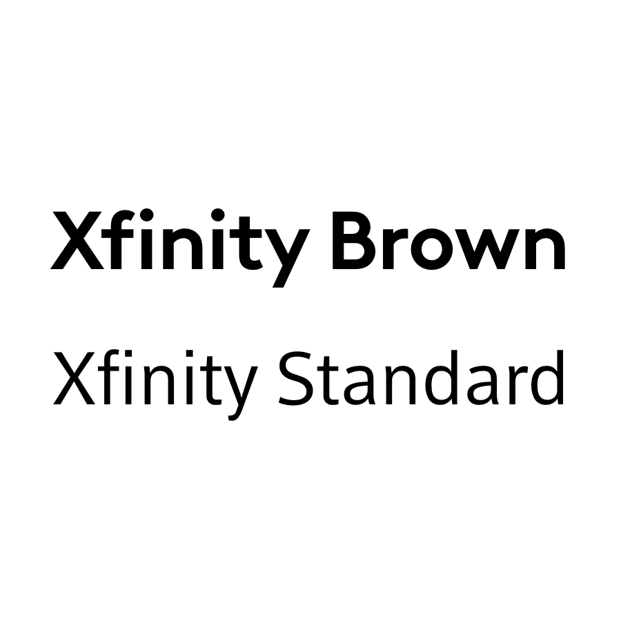
Xfinity Brown is our primary and most expressive typeface. It should be used for headlines, short-form body copy, and other elements deserving emphasis, like subheads and calls to action. Xfinity Brown is always set with -20 kerning and auto leading.
Download TypefacesOur Type
Hi, I'm Xfinity Brown
and I'm Xfinity Standard
Style & Weight
Headlines are set in Xfinity Brown Bold. They should be conversational and used for emphasis.
Subheads are set in Xfinity Brown Bold. They are always set in a smaller font size than the headline.
Short-form body copy is set in Xfinity Brown Regular. Short-form body copy should be two to five sentences in length. Typically this is the only body copy on the creative.
Long-form body copy is set in Xfinity Standard Regular with auto leading. Long-form body copy is over five sentences long and typically used when there are multiple body copy text blocks. This can include bullets, detailed product descriptions and digital communications.
Calls-to-action are set in Xfinity Brown Bold.
Legal copy is set in Helvetica Neue Condensed LT Std with auto leading, no smaller than 8pt.
Headlines are set in Xfinity Brown Bold. They should be conversational and used for emphasis.
Subheads are set in Xfinity Brown Bold. They are always set in a smaller font size than the headline.
Short-form body copy is set in Xfinity Brown Regular. Short-form body copy should be two to five sentences in length. Typically this is the only body copy on the creative.
Long-form body copy is set in Xfinity Standard Regular with auto leading. Long-form body copy is over five sentences long and typically used when there are multiple body copy text blocks. This can include bullets, detailed product descriptions and digital communications.
Calls-to-action are set in Xfinity Brown Bold.
Legal copy is set in Helvetica Neue Condensed LT Std with auto leading, no smaller than 8pt.
Type Examples
Photography
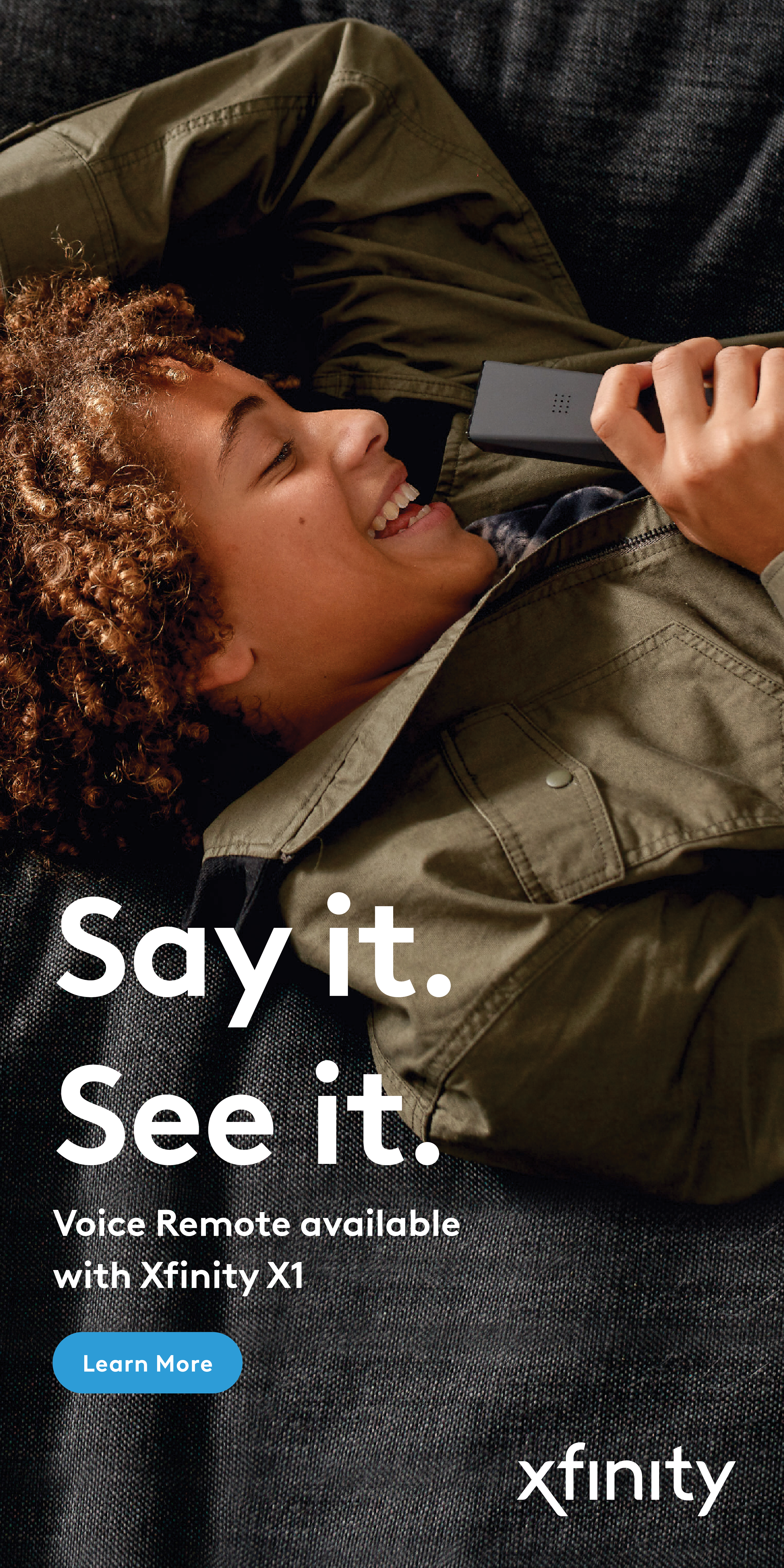
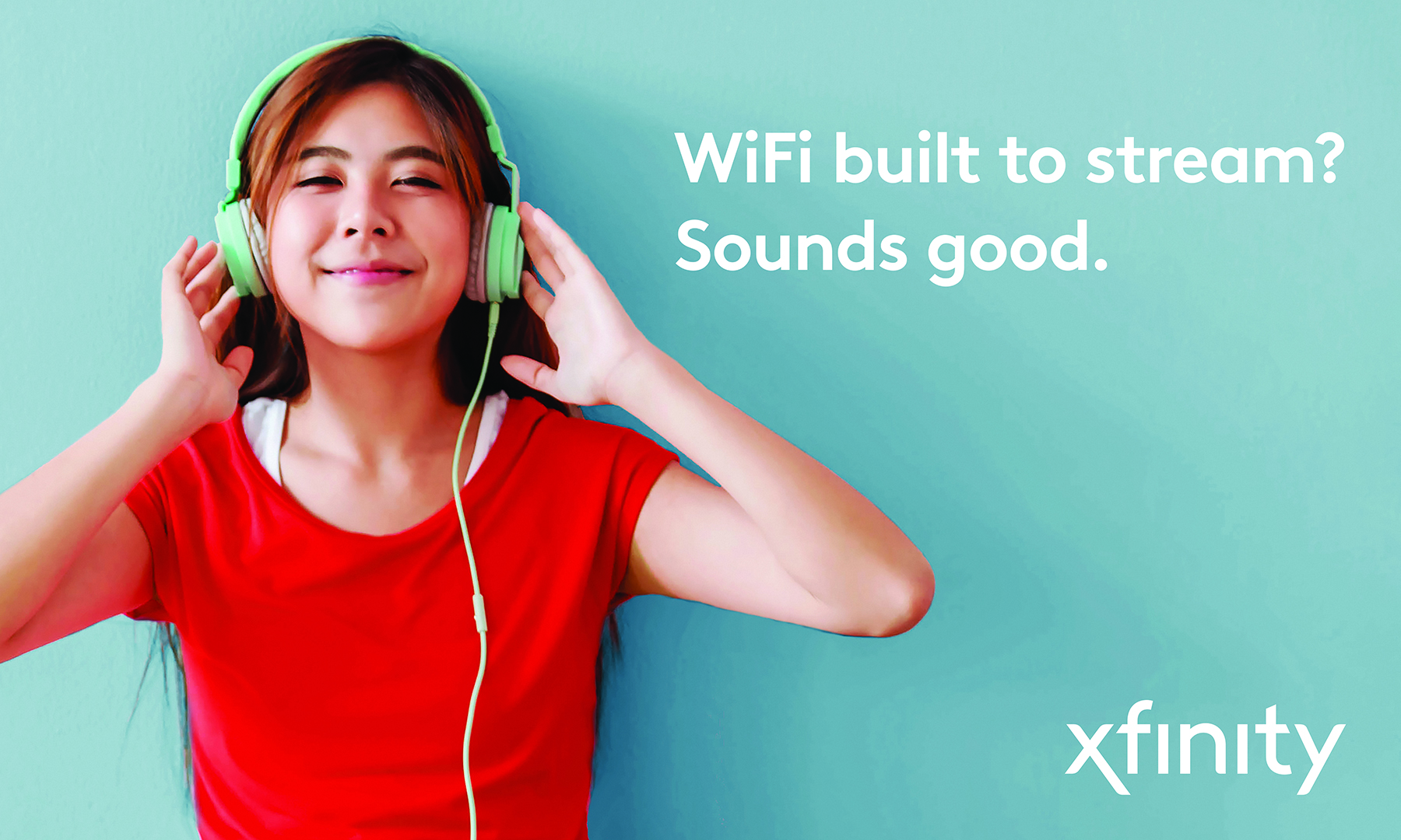
Our photography reinforces our design principles, showcasing simple, focused and unique imagery with unexpected perspectives. Our photography captures authentic moments and employs a clean color palette with occasional pops of color. All photography is naturally lit and unfiltered.
Explore PhotographyLifestyle
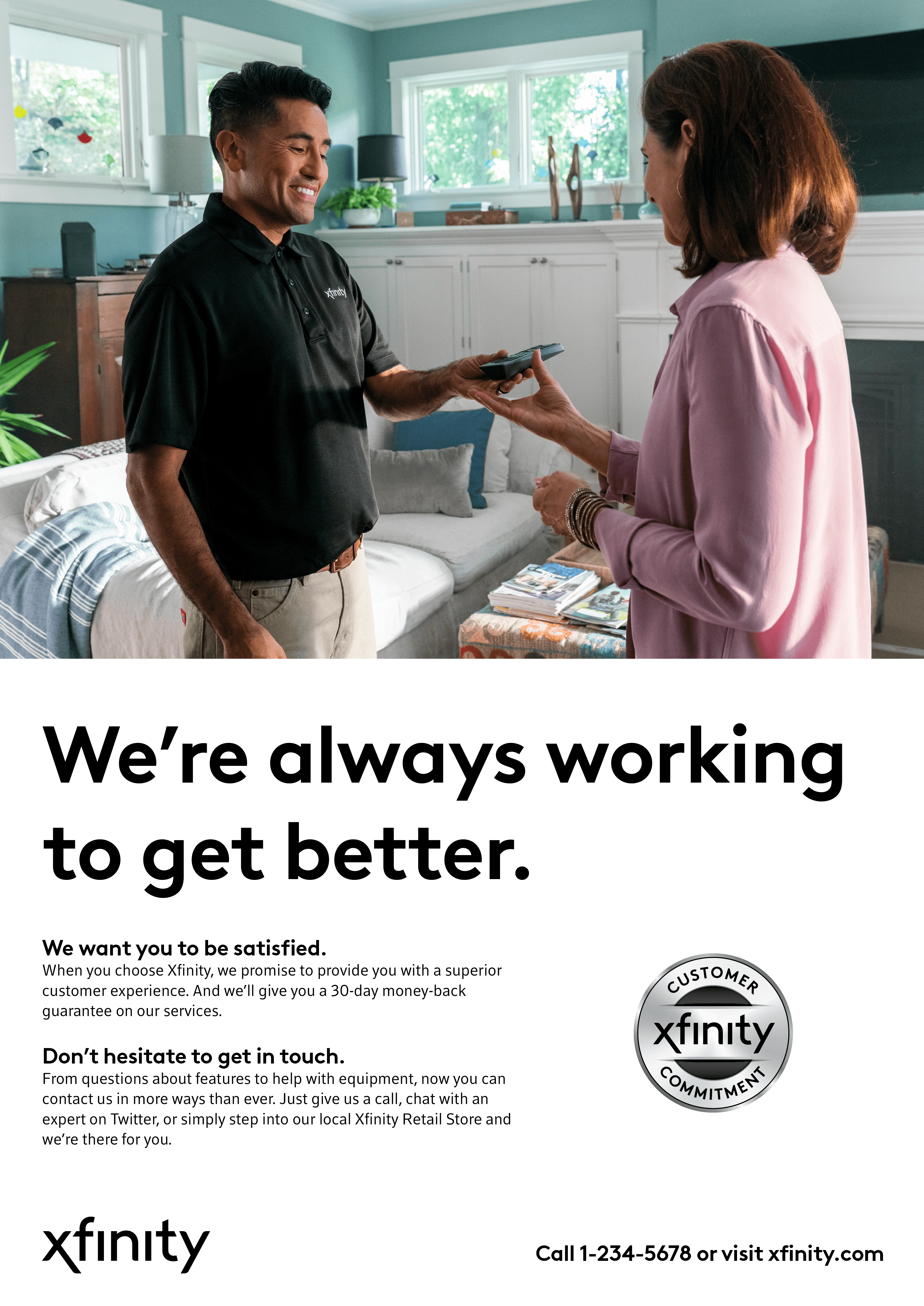
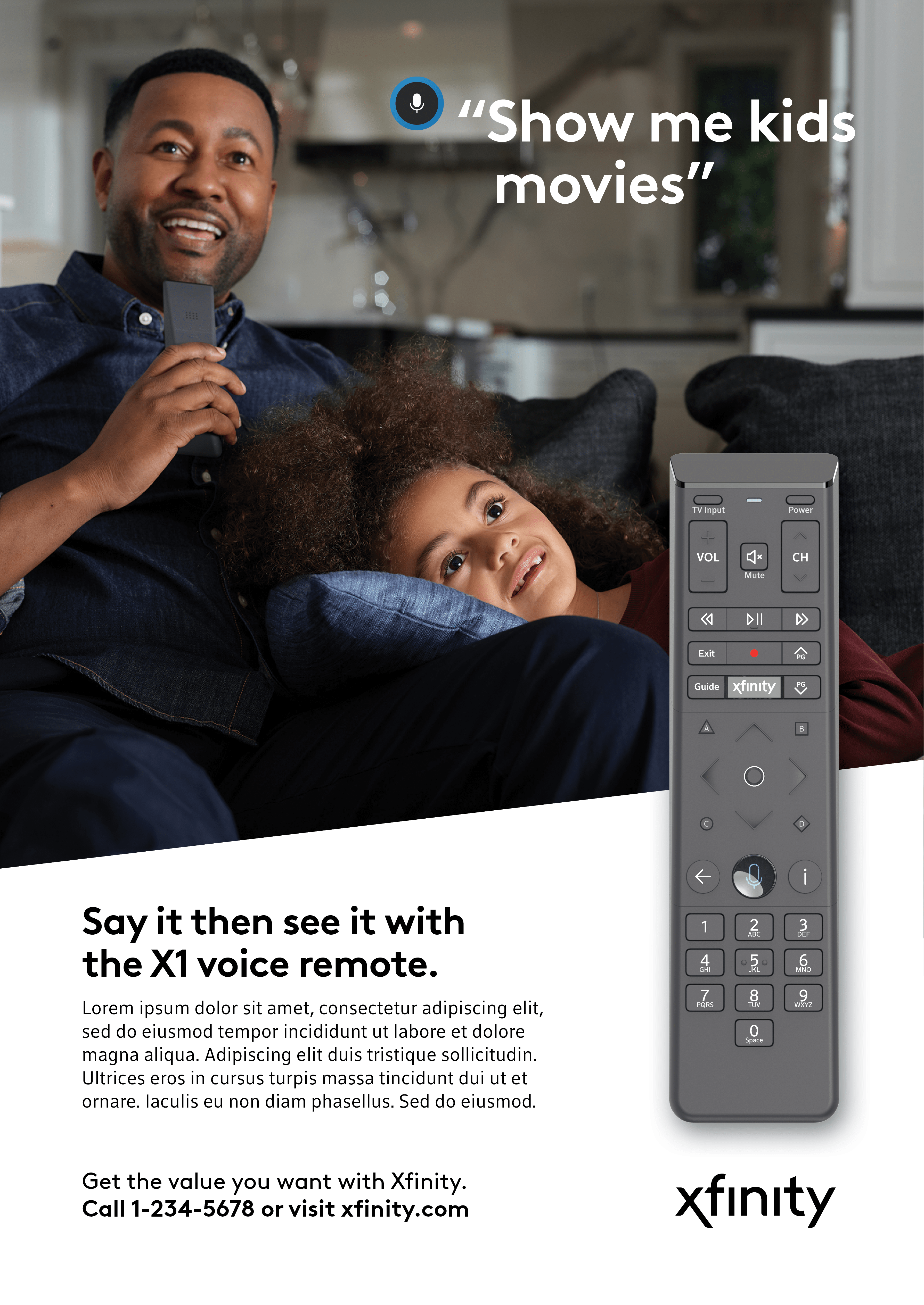
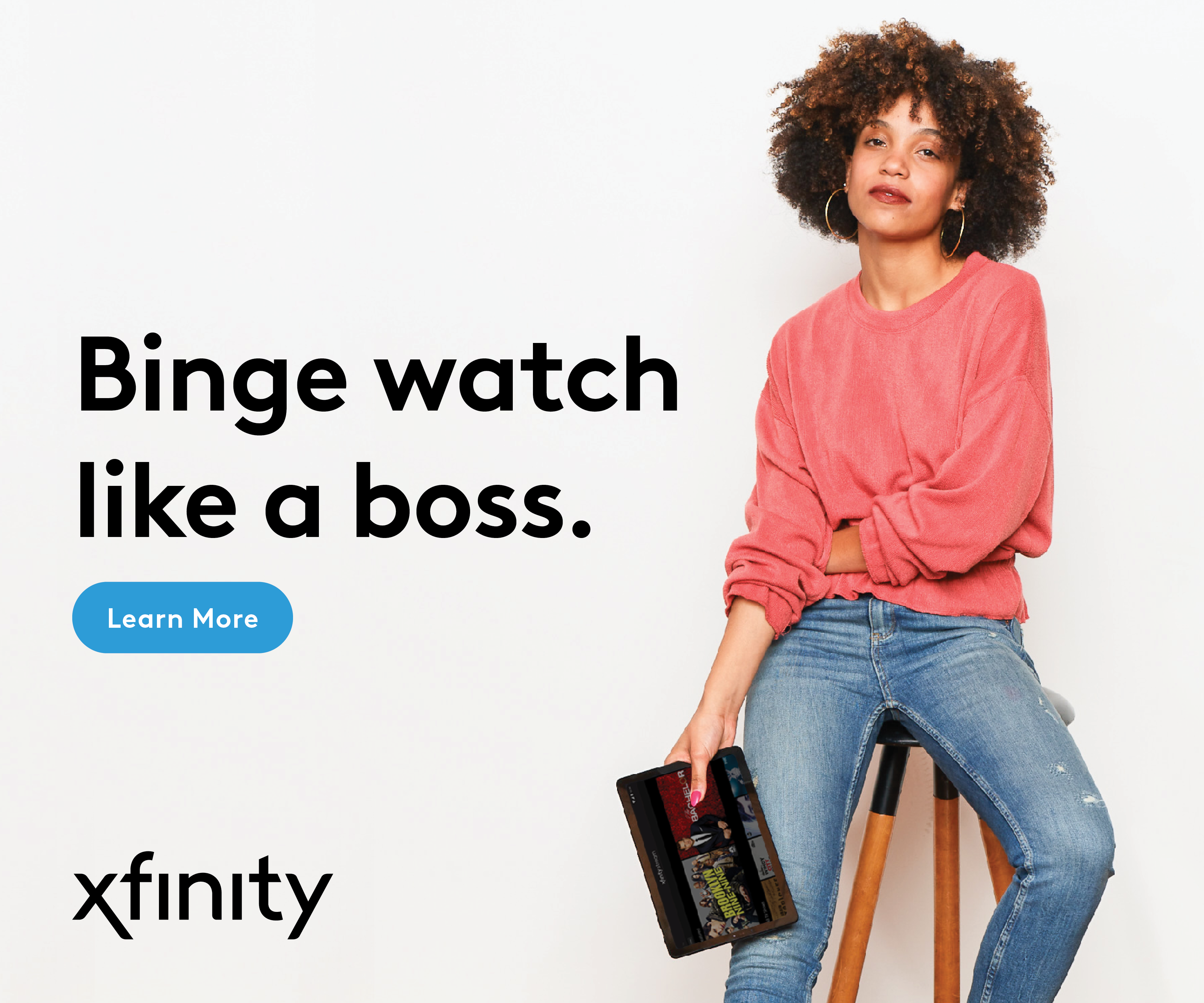
To emphasize brand storytelling, lifestyle imagery should be used as much as possible. This imagery allows us to be more human and adds warmth to our creative.




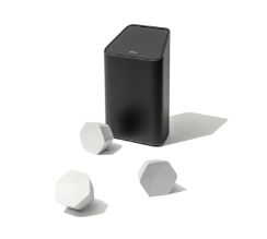
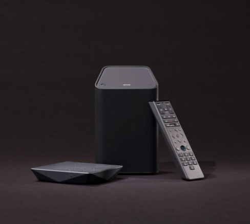
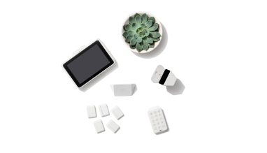
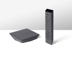
Xfinity Hardware
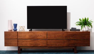
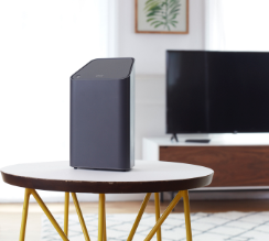
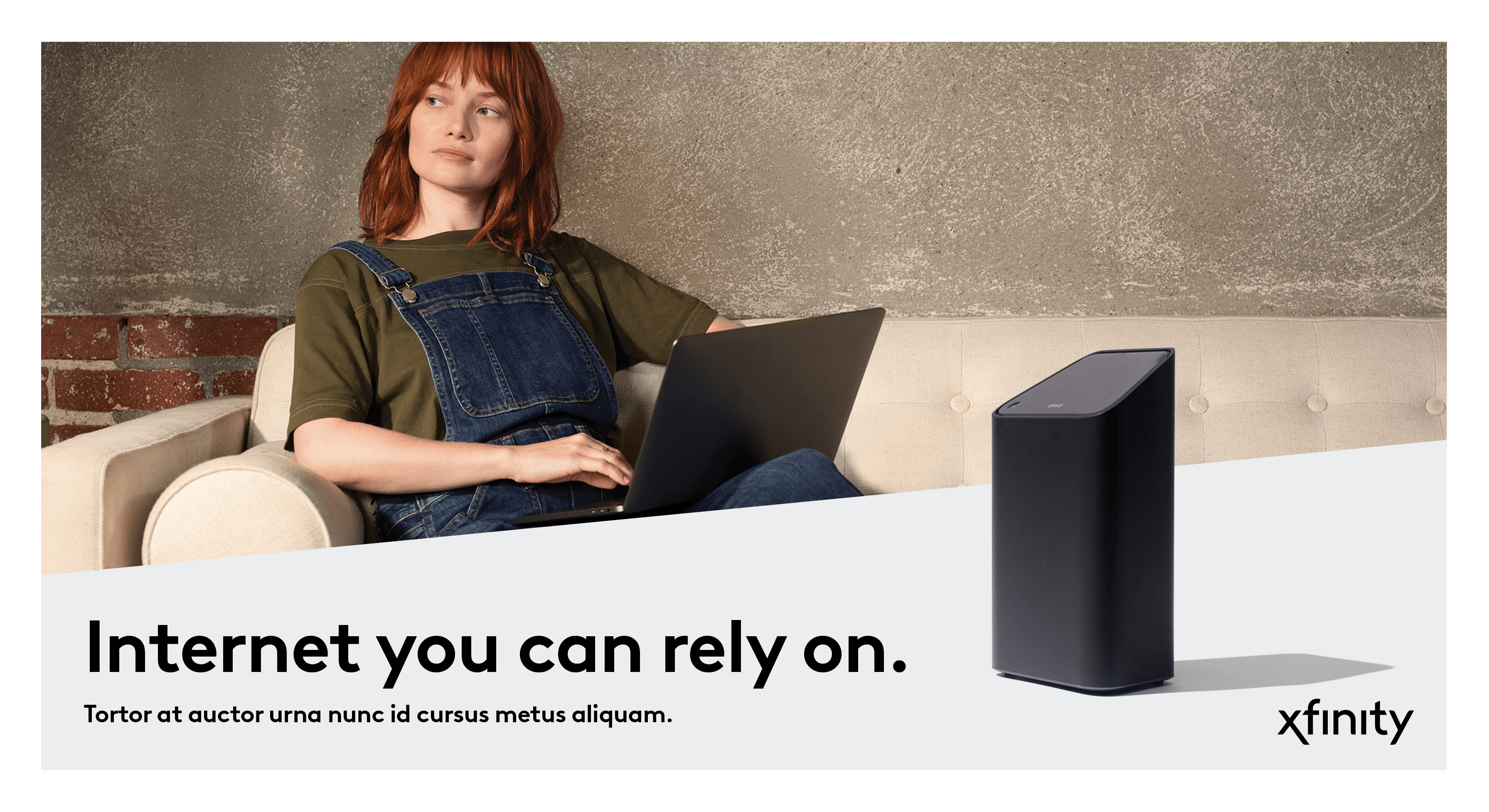
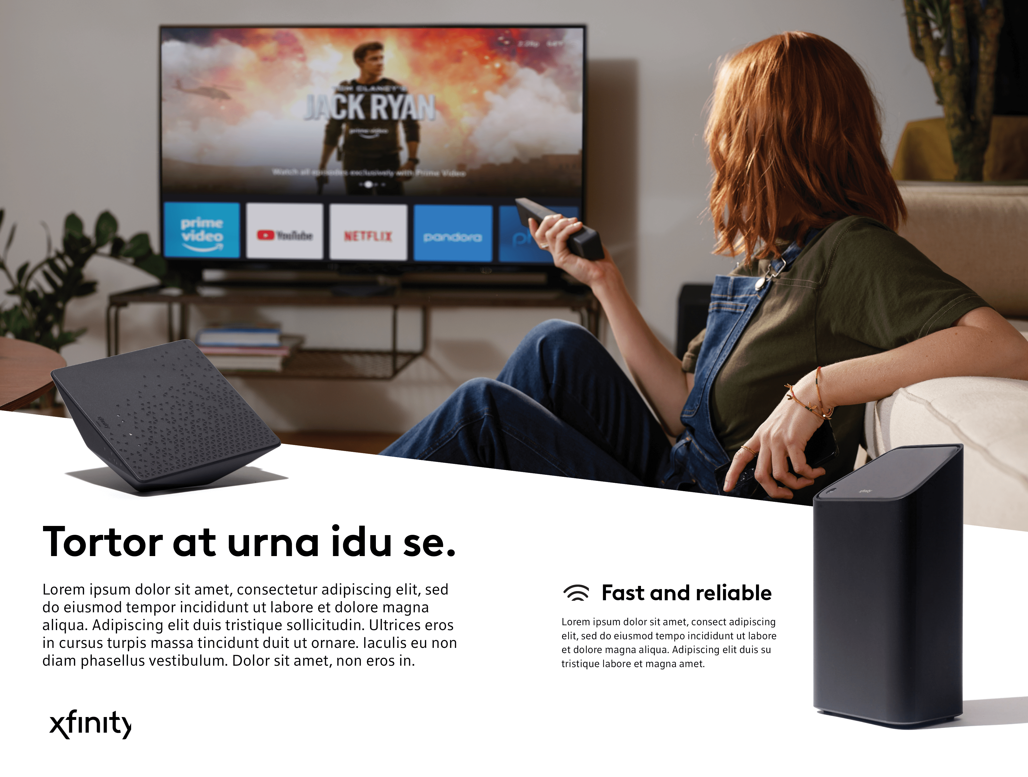
Xfinity hardware should be showcased when possible to reinforce our beautifully designed and differentiated products.
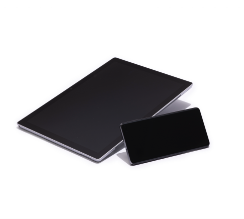
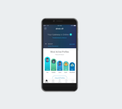
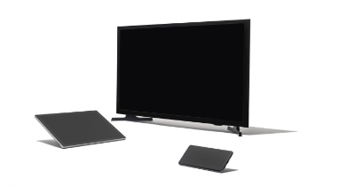
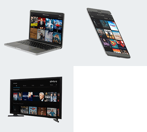
Generic Devices
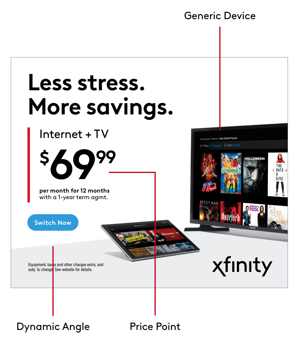
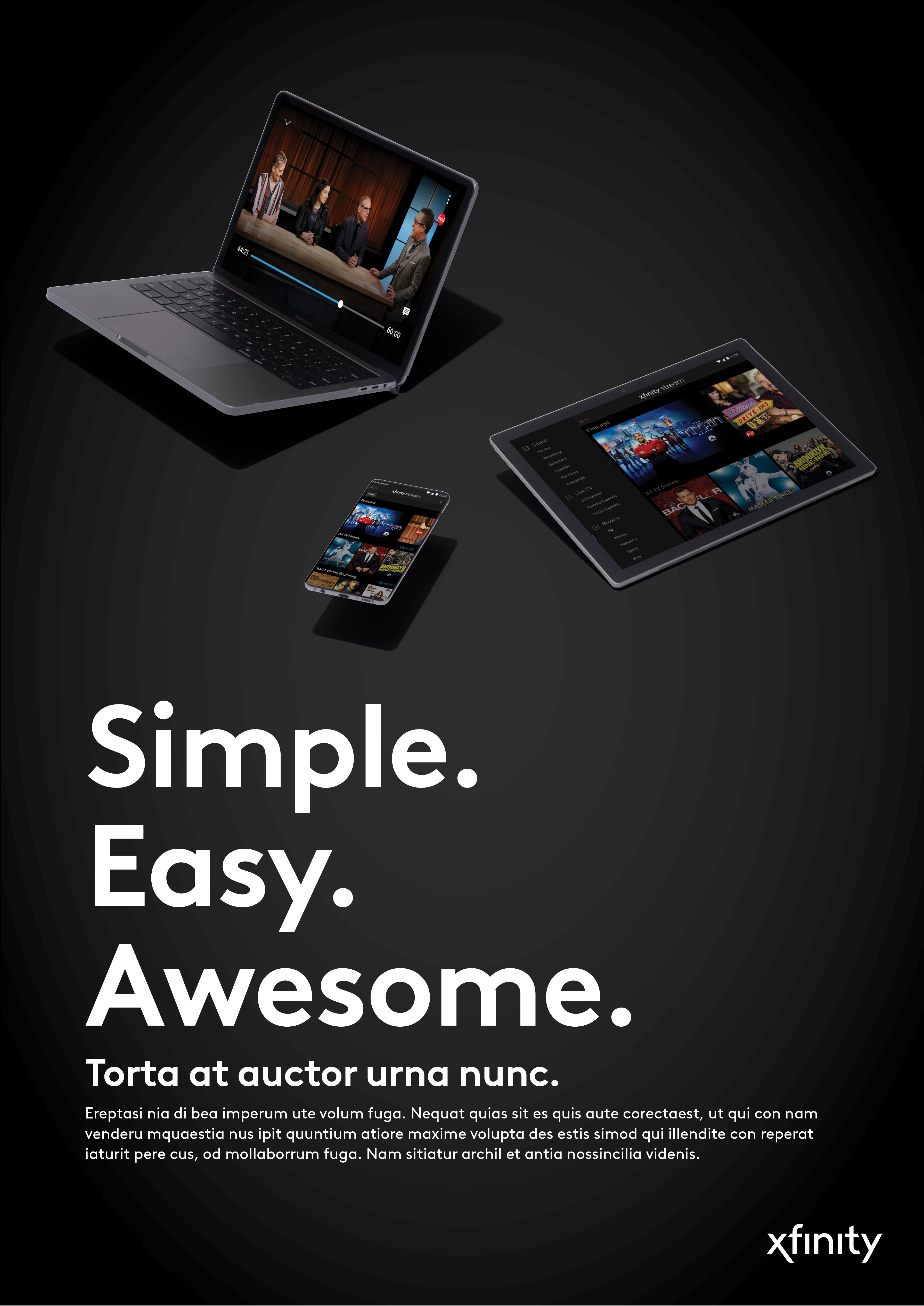
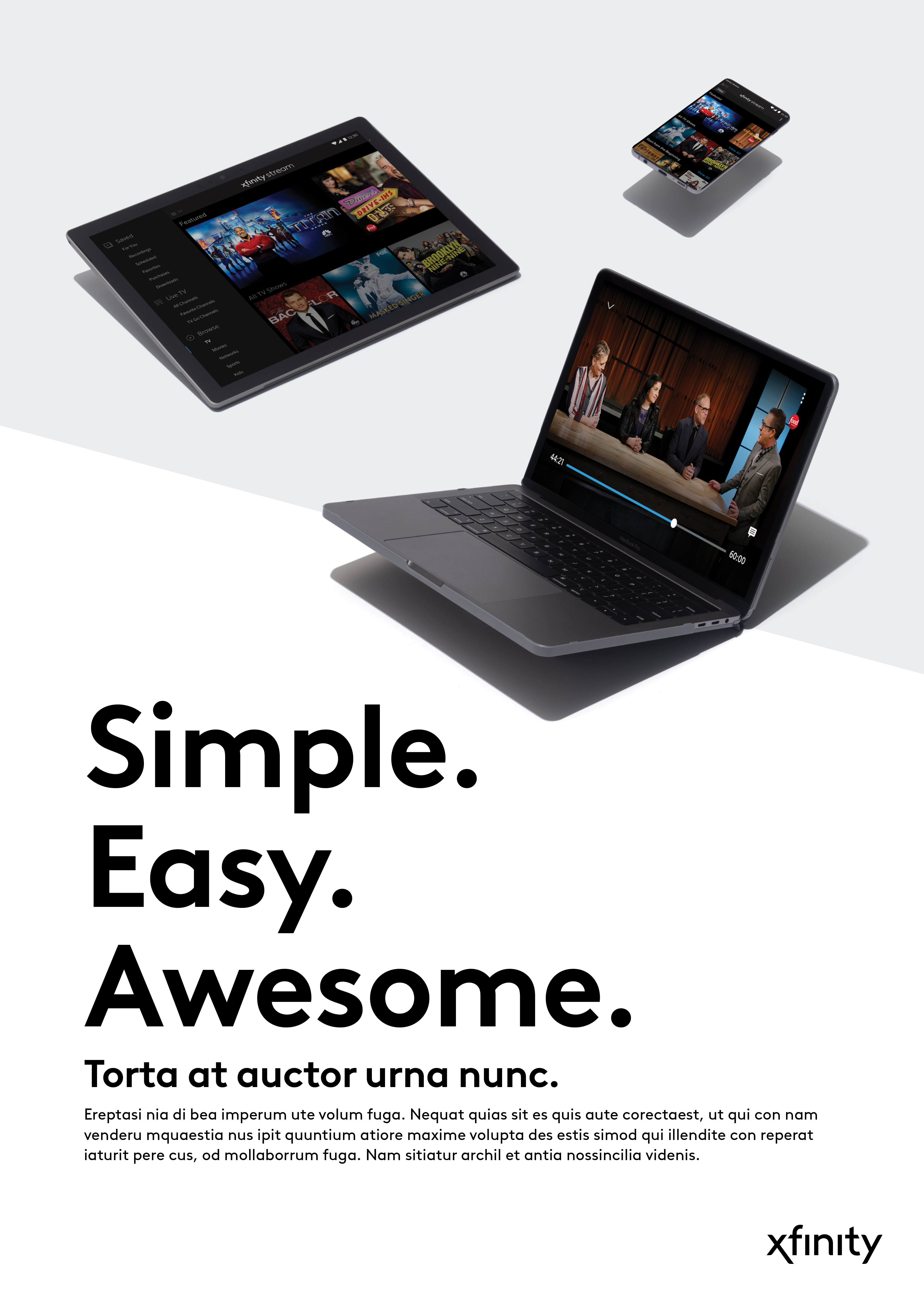
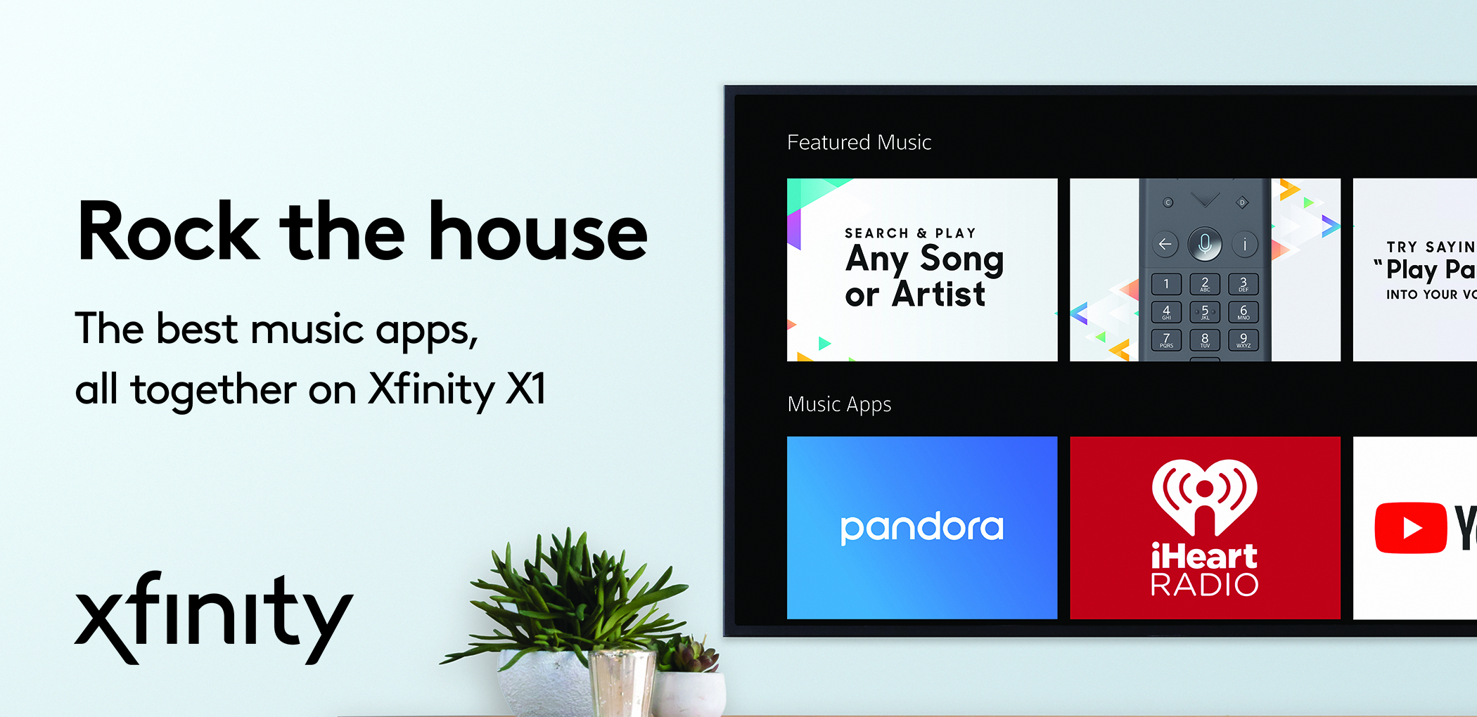
Generic device imagery is used to hero our UI screens and reinforce our unique experiences and services.
In-Situation
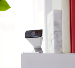
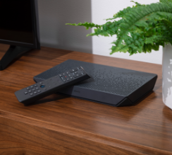
In-situation photography uses our hardware, generic devices, and key props to tell a cohesive story. These images should be used in combination with lifestyle imagery for deeper brand storytelling.
Secondary Graphics
Our secondary graphics library helps us tell a greater brand story. They should not be used to replace the primary Xfinity logo, but rather further communications about specific product experiences. Please do not create any new secondary graphics.
Explore Secondary GraphicsMobile App Icons
-
 Xfinity xFi
 Xfinity Mobile
 Xfinity Home
 My Account
 WiFi Hotspot
 Connect
 Xfinity Remote
 Xfinity Stream
Our mobile app icons can be used sparingly in creative to drive further awareness about our mobile experiences.
-
 Apple App Store badge
 Google Play App Store badge
All of our apps can be downloaded in the Apple App Store or on Google Play, and when including a CTA to download, you may feature the app store badges.
Additional Graphics
-
 Customer Commitment Badge
The Customer Commitment Badge is available for communications that reference our customer service promise.
-
 Voice Remote Icon
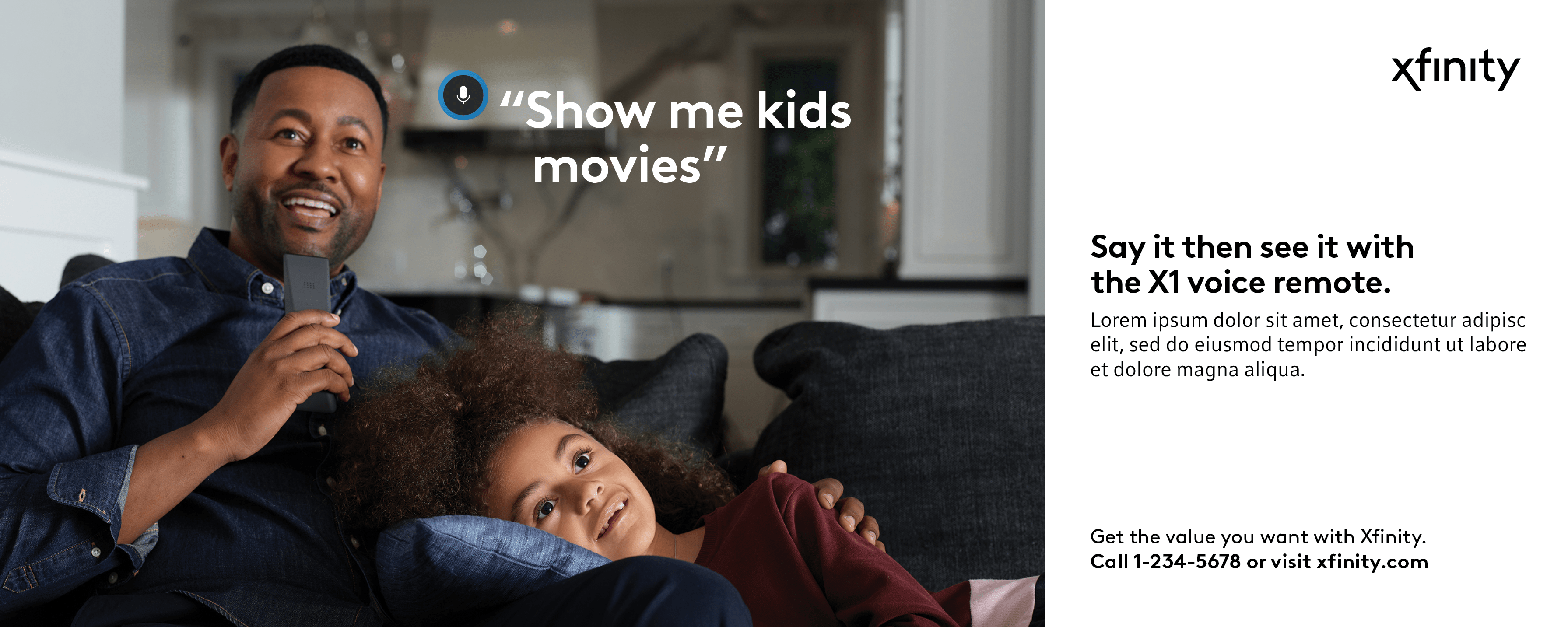
Use the Voice Remote Microphone Button on communications that mention voice commands.
-
 WiFi
WiFi
The WiFi icon is to be used in communications that reference in-home WiFi or connectivity on the go.
-
 WiFi Hotspot
The WiFi Hotspots icon should be used selectively and sparingly only in dedicated WiFi Hotspots communications.
Graphics in Use
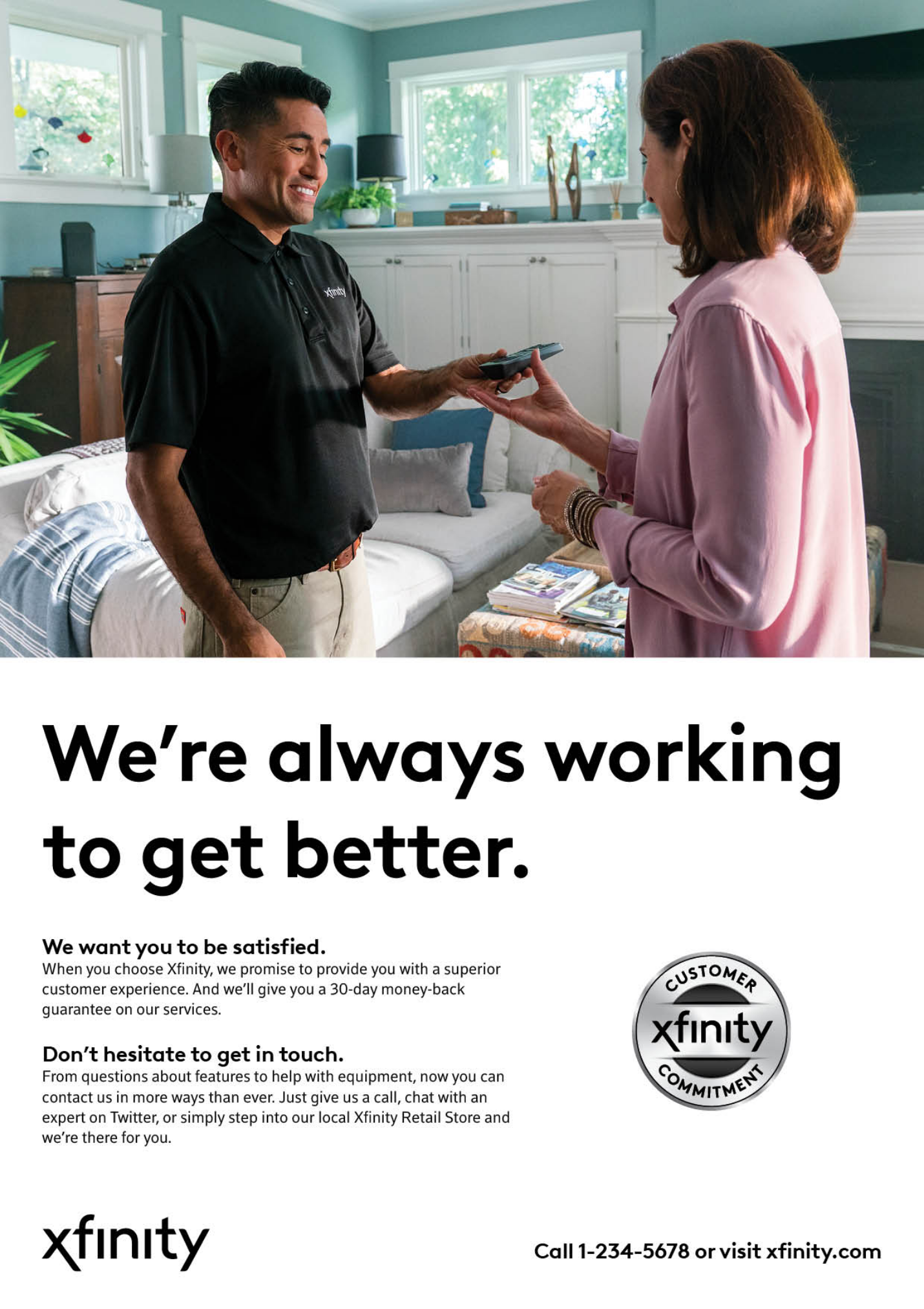
Design System
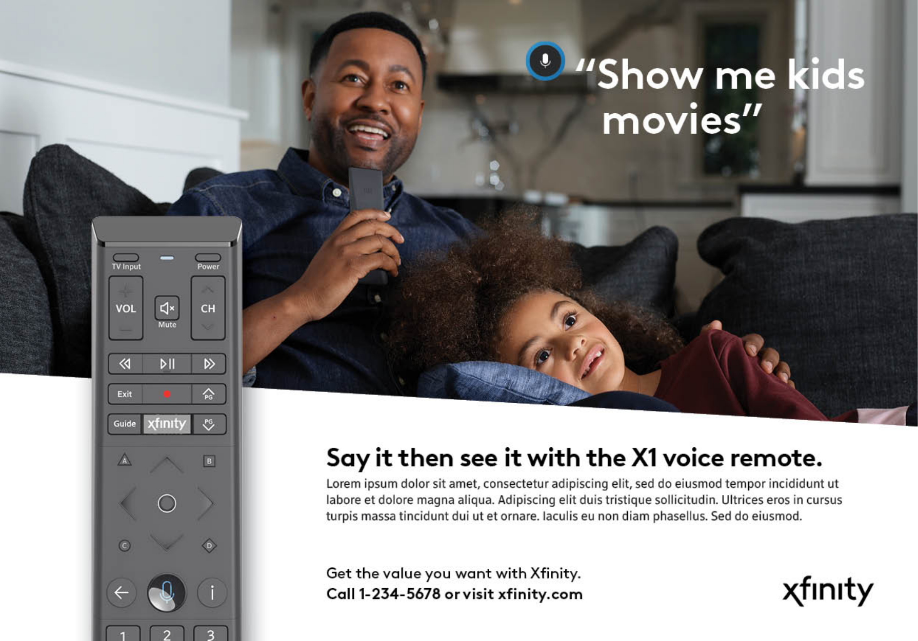
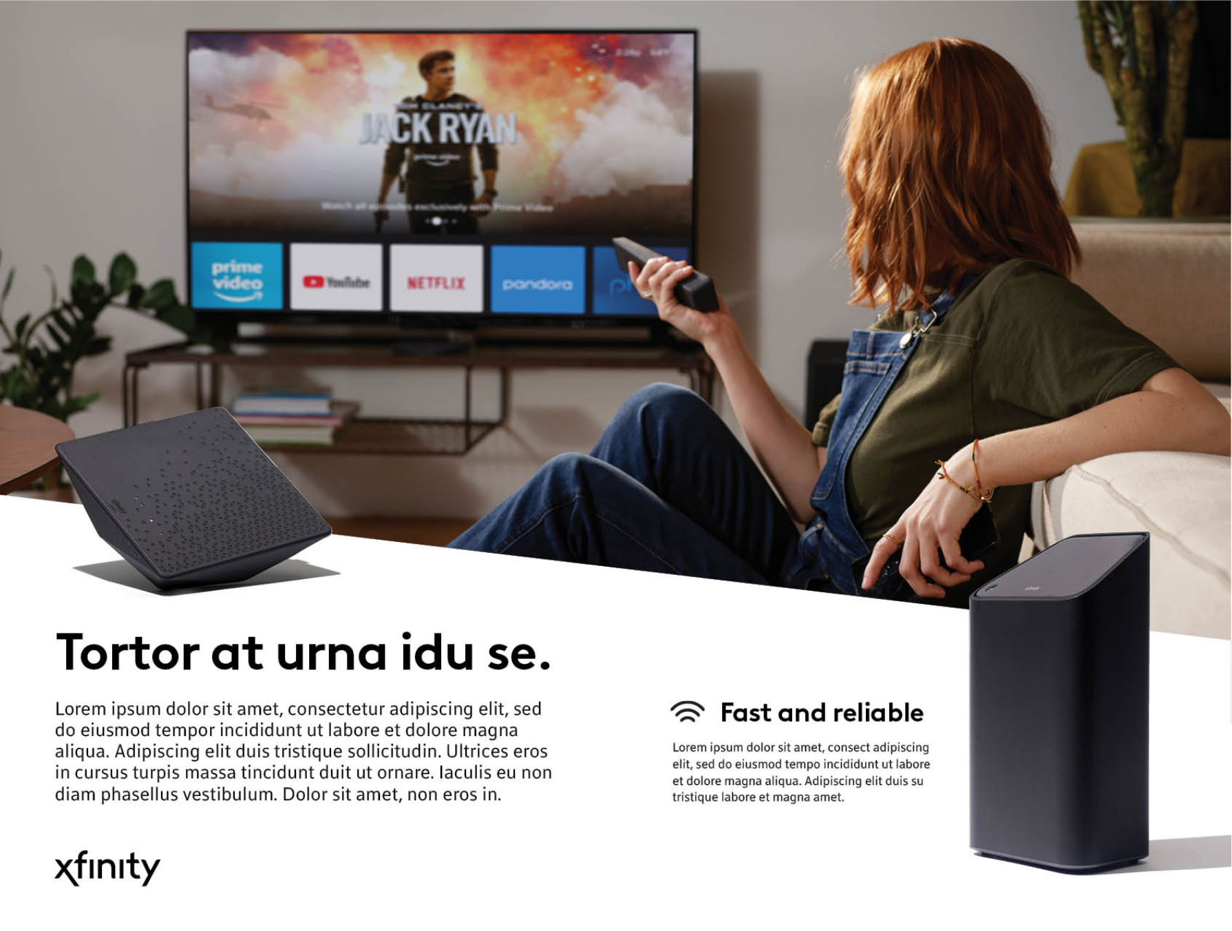
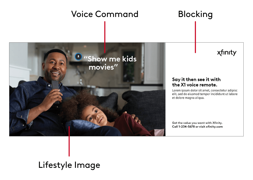
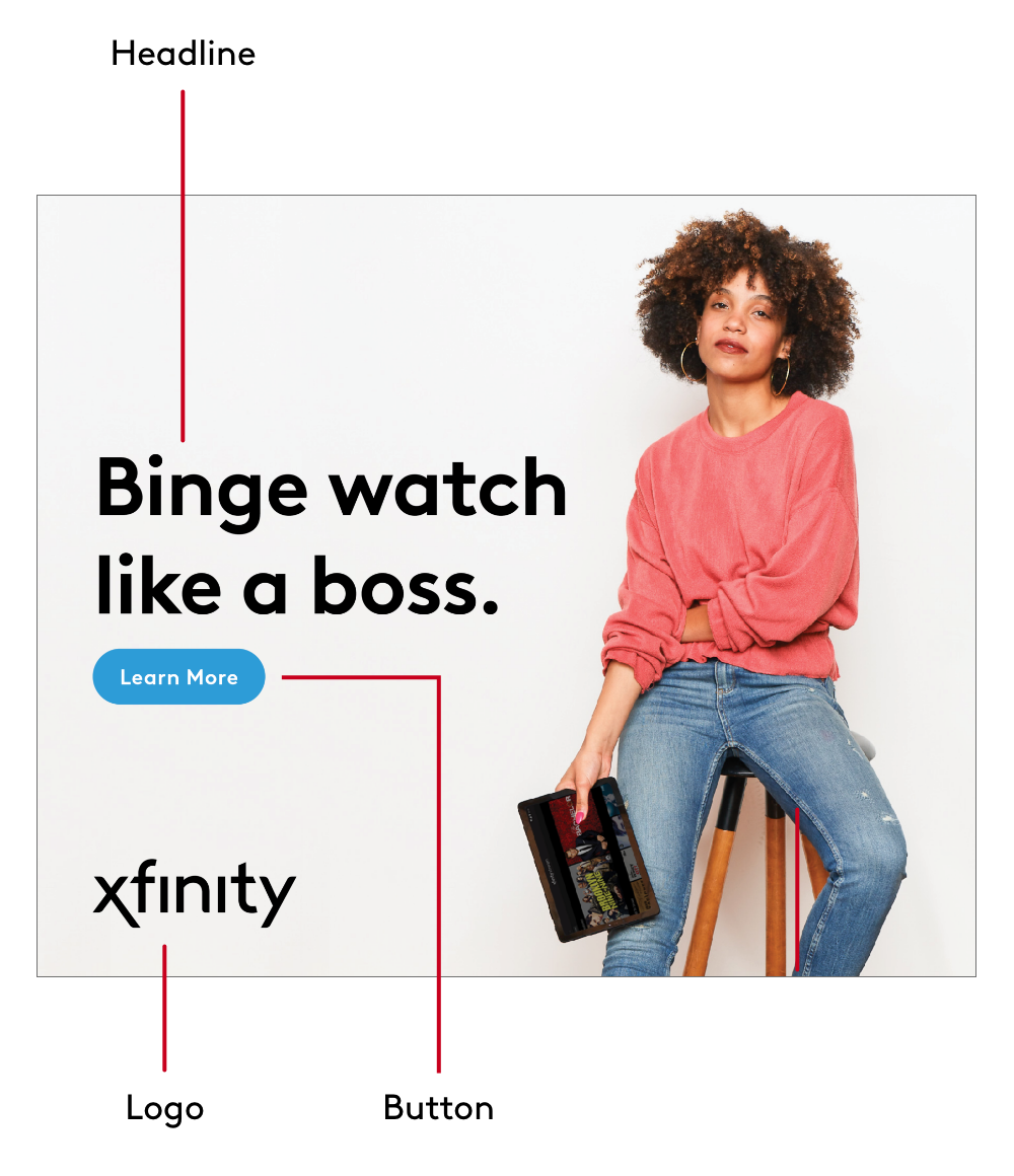
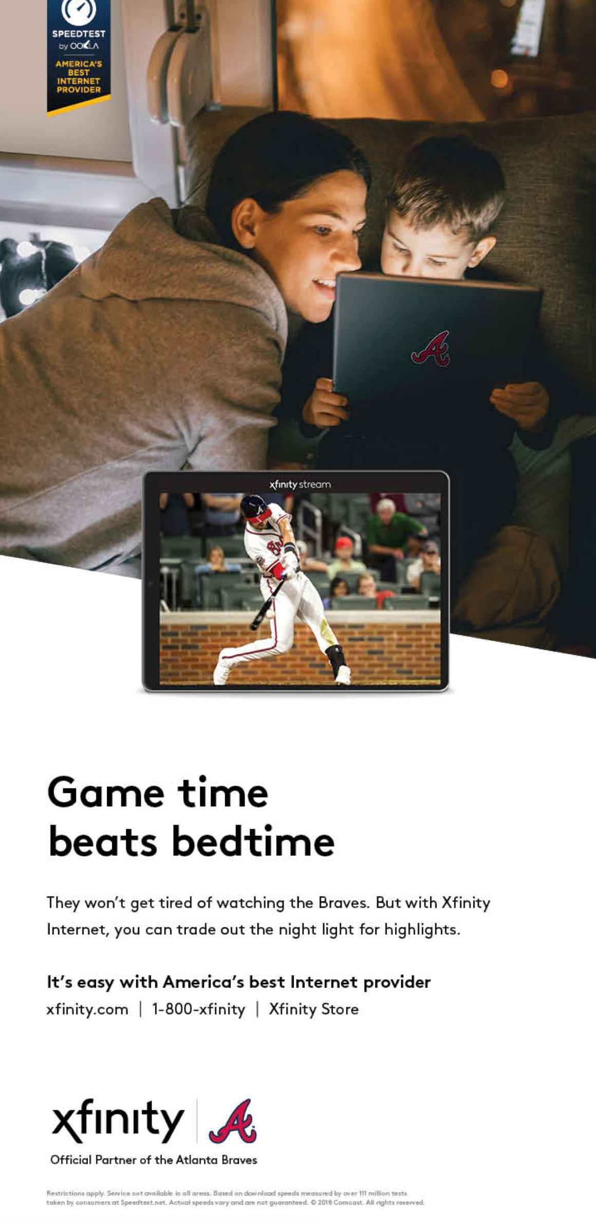
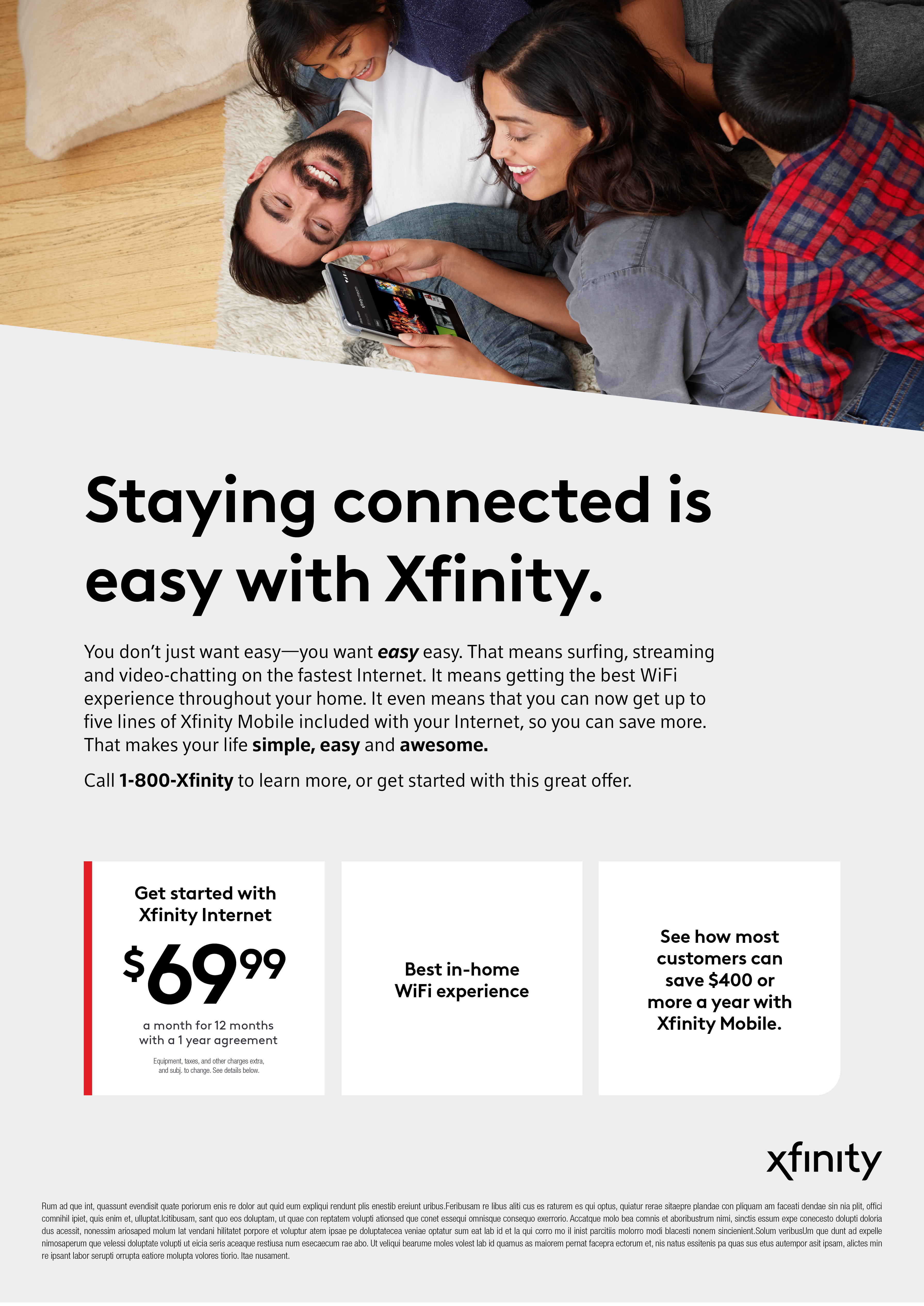
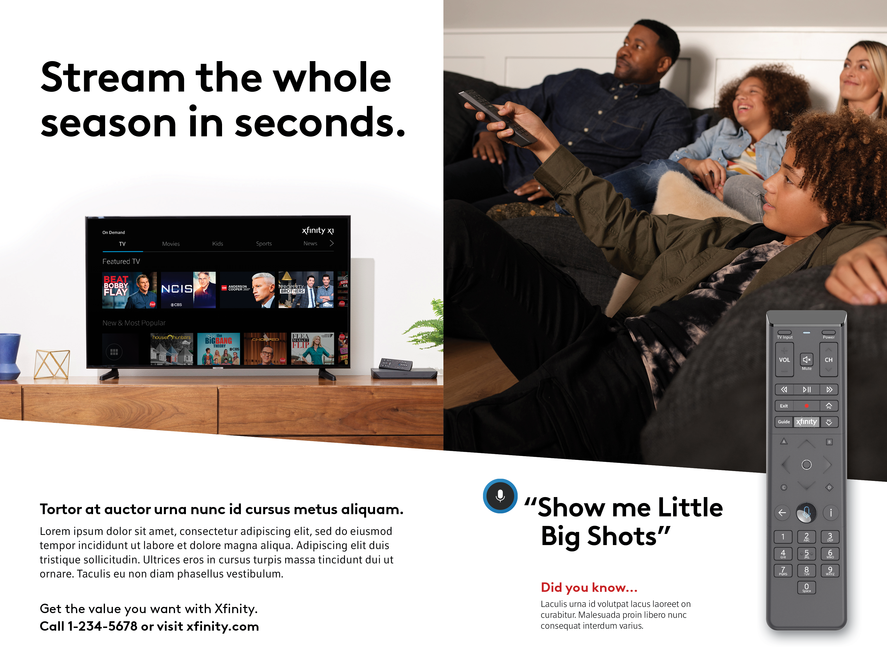
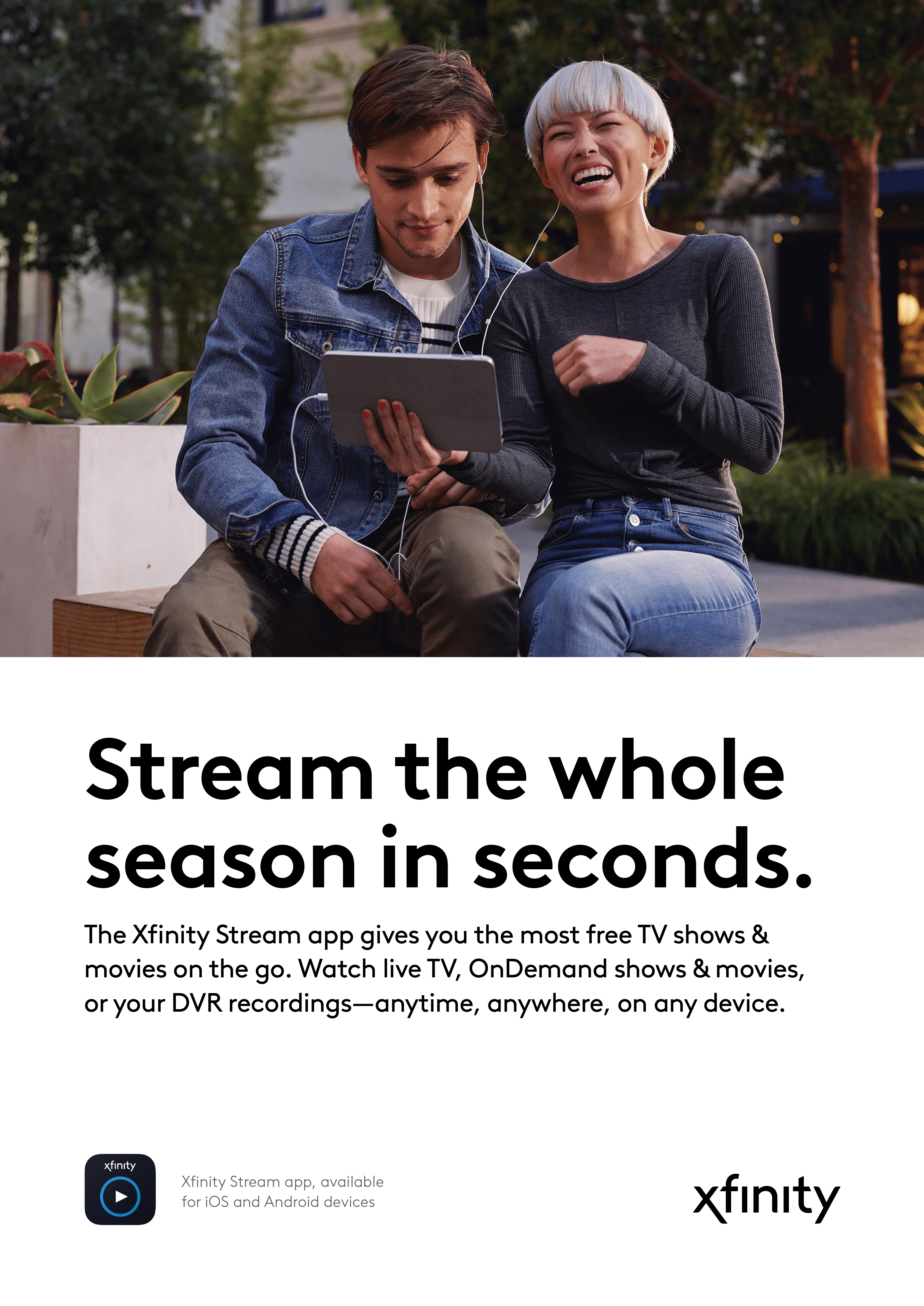
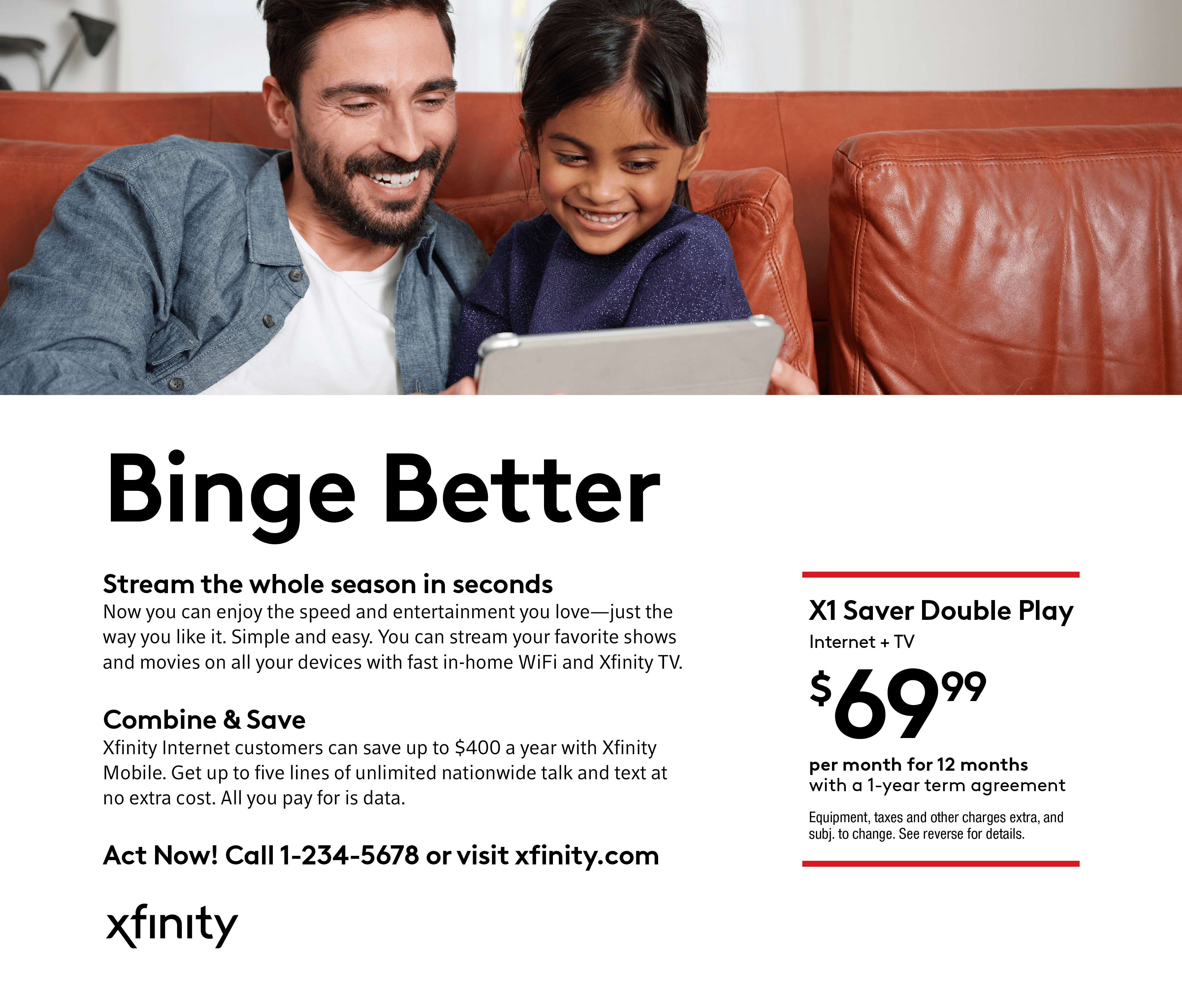
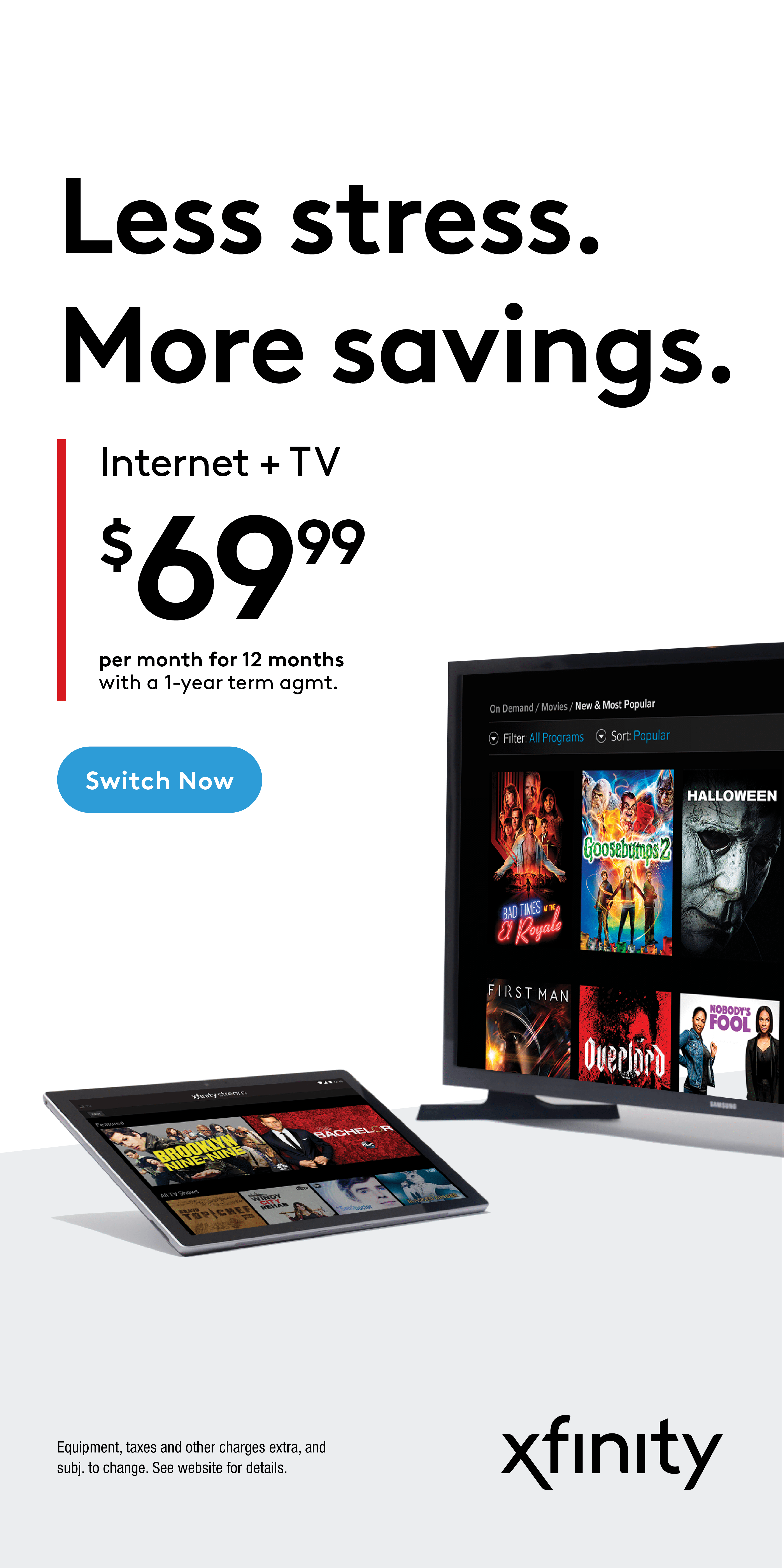
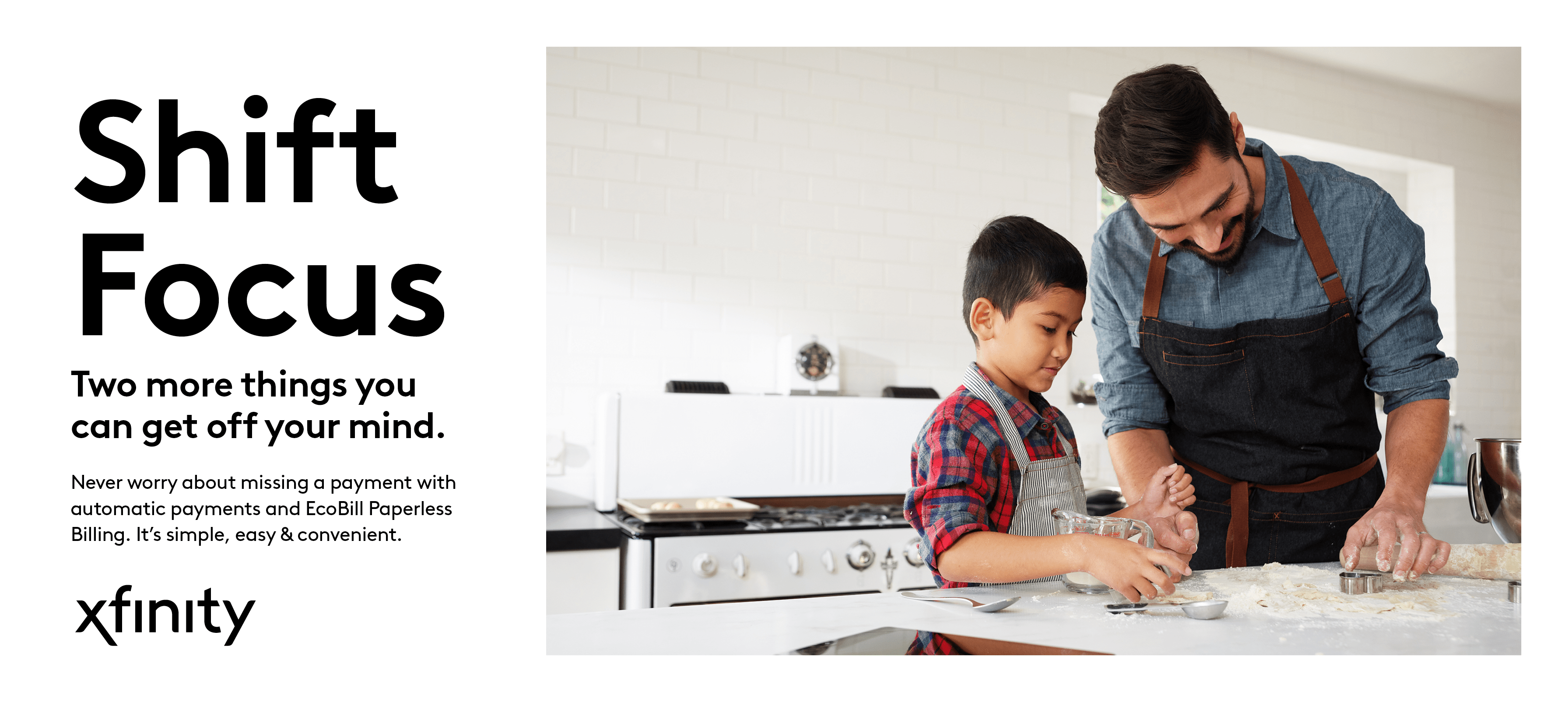
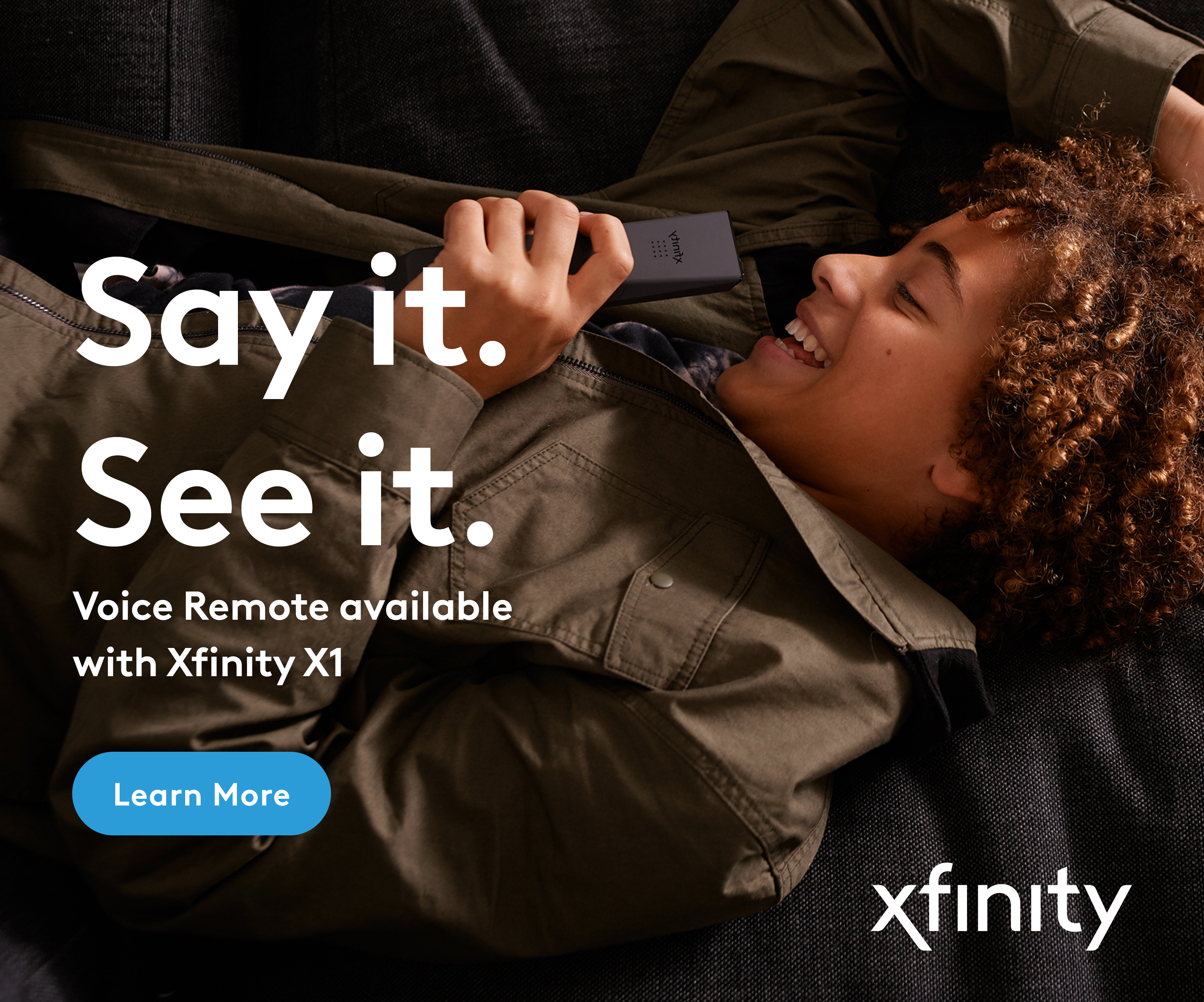
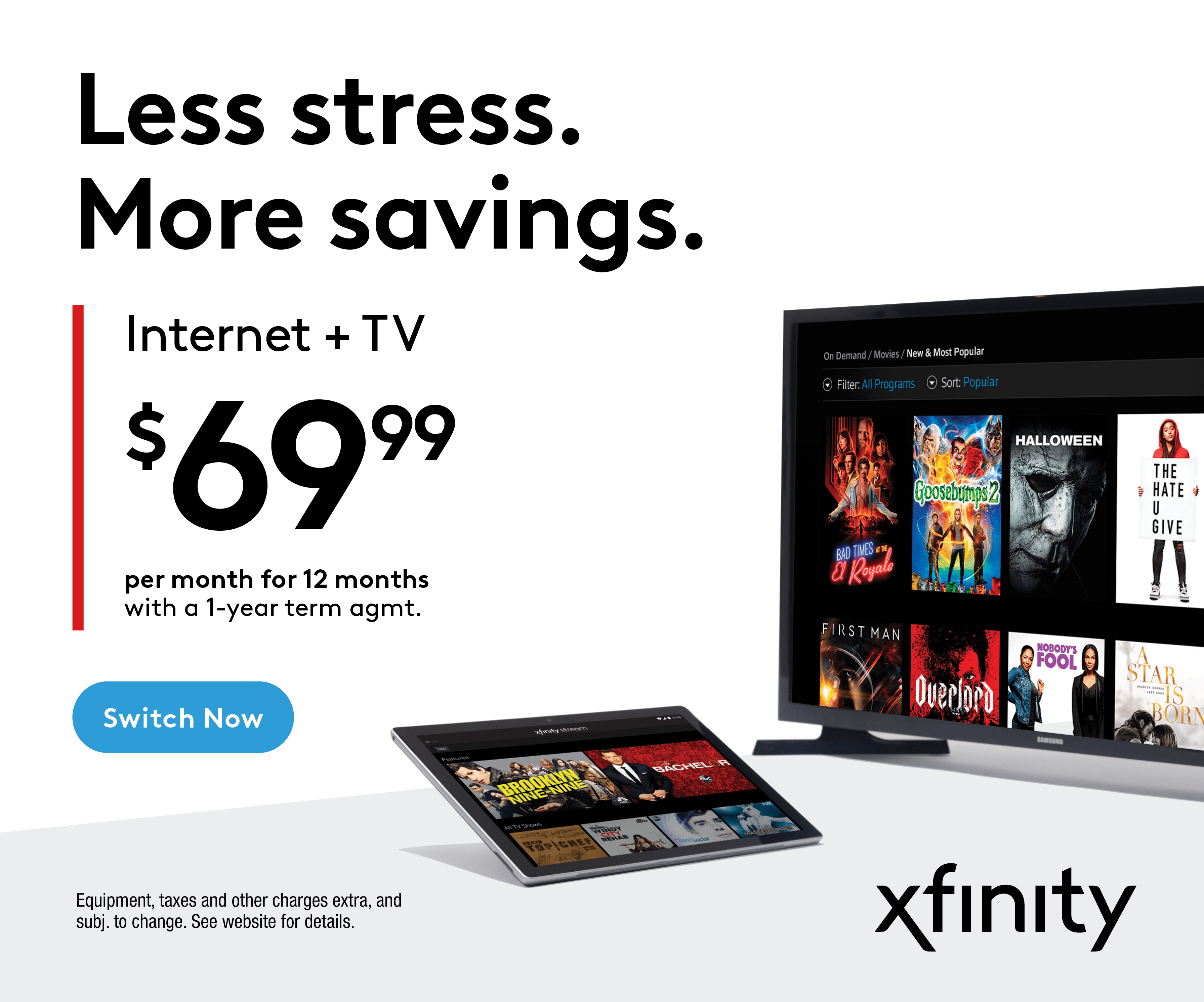
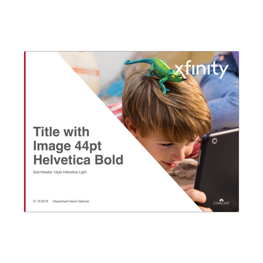
Our design system allows for flexibility across communications of all sizes. Layouts with a clear information hierarchy and plenty of white space help guide the eye and allow customers to easily understand the key message.
The dynamic angle is a tool that can be used to structure information and create containers for imagery or copy. They should be used in a purposeful manner to create depth or act as a plane for devices to lay on. For more detailed guidance about our design system please download our full brand guidelines.
Download Xfinity Brand Guidelines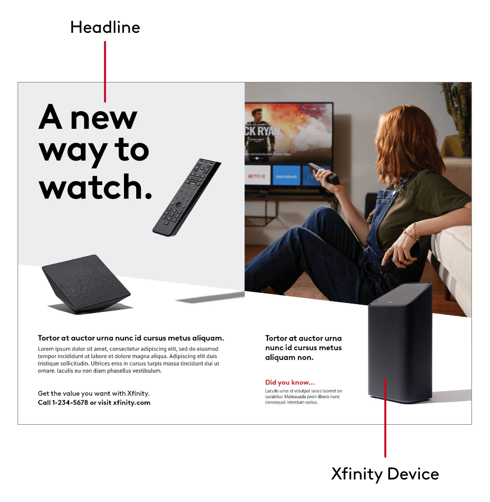
Co-Branding
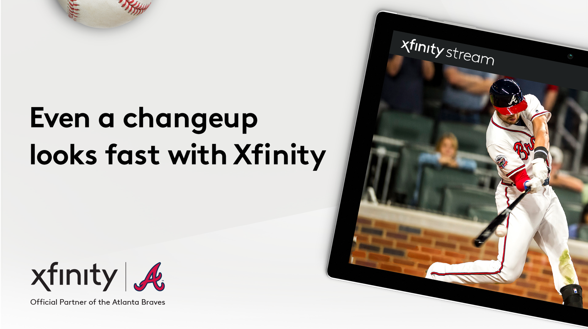
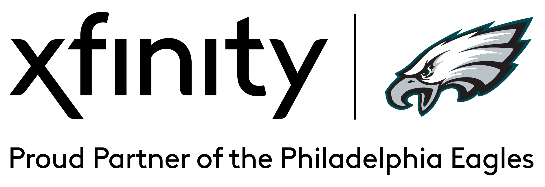
Xfinity supports a variety of partners and experiences to reinforce our brand purpose and passions. Please set co-branded lock ups with a 1:1 size relationship between logos and set them horizontally.
For endorsements or experience sponsorships, we may use a descriptive line along with our Xfinity logo. In most cases, this text will be in sentence case.
Download Co-Branding TemplatePartnership
Endorsement

Brand Messaging Framework
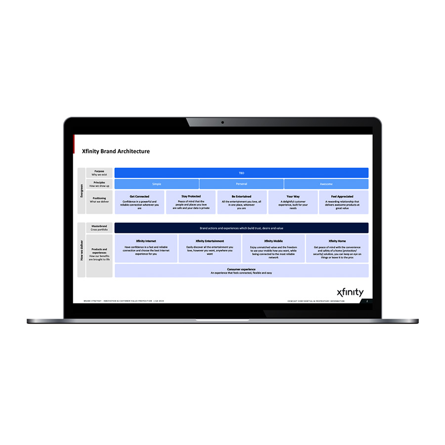
Every communication is an opportunity to drive trust and value with our customers. The Xfinity Brand Messaging Framework is the foundation to build every communication with messaging that is benefit-led, single-minded, and consistently reinforces our brand purpose, principles and positioning across the consumer journey.
Explore Brand Messaging Framework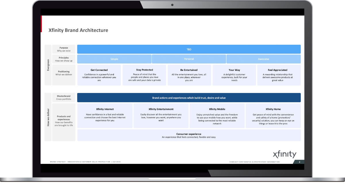
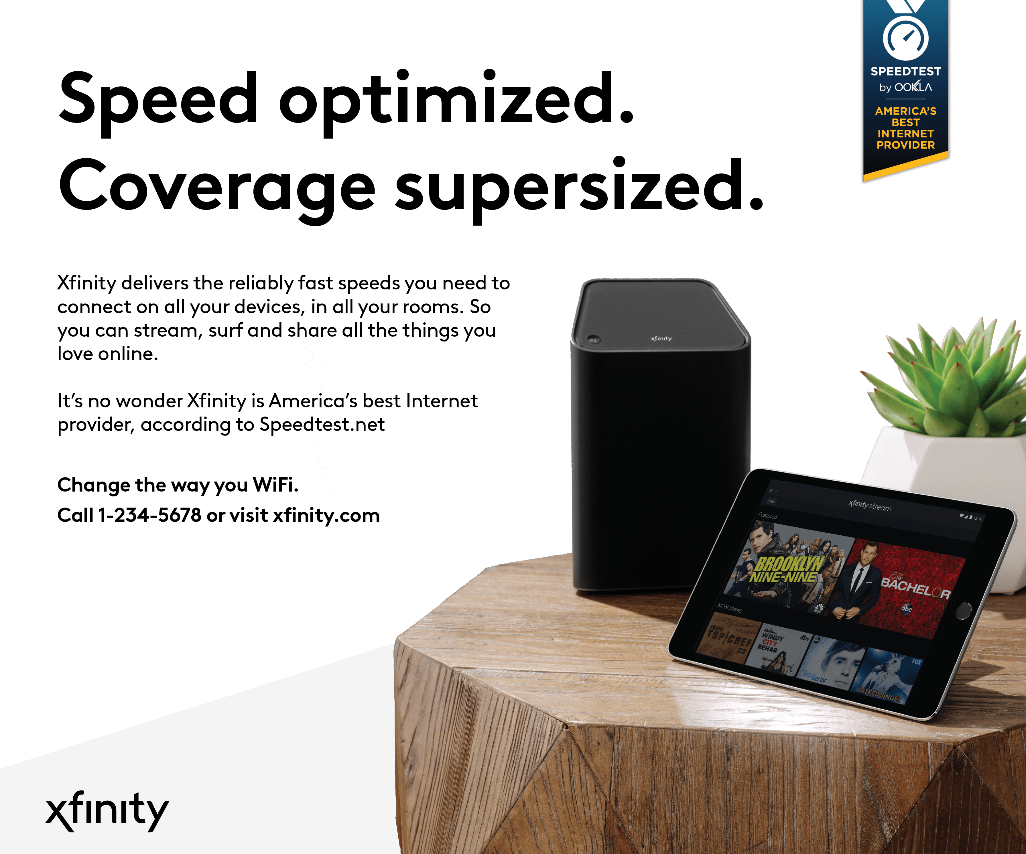
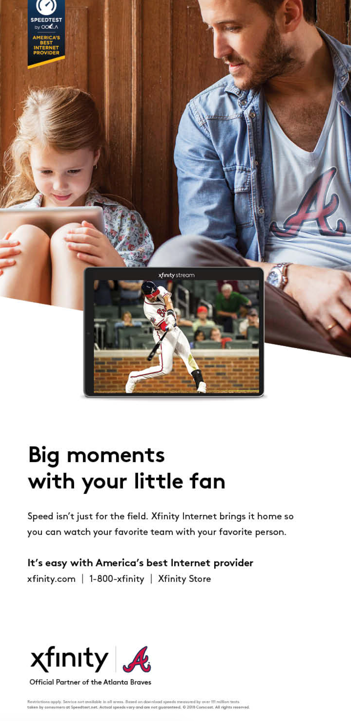
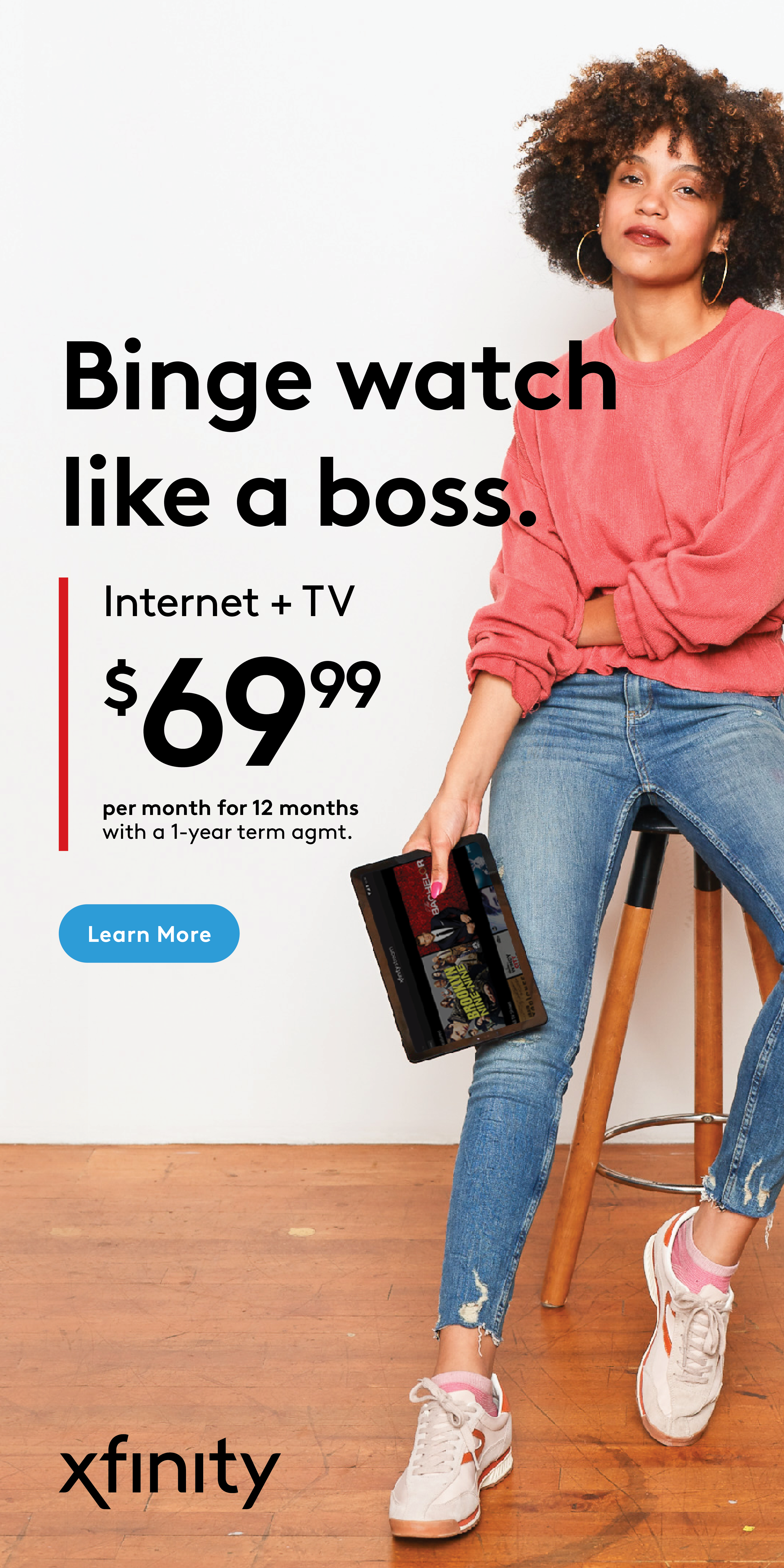
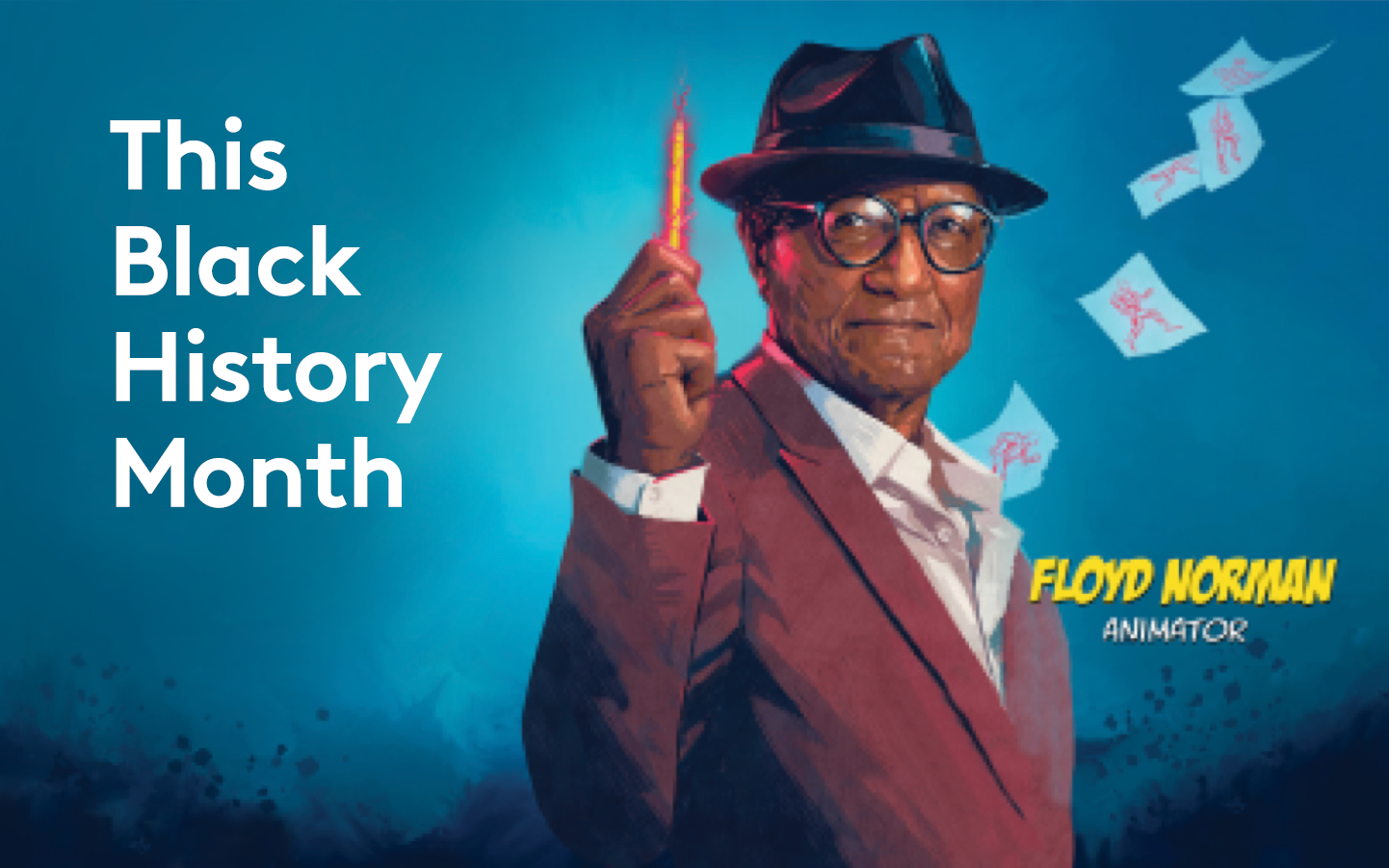
Creative Examples







Downloads


Contacts & Resources
Questions, comments or feedback? Feel free to email the Xfinity Brand Team. We’d love to hear from you.
Discover additional assets in the links below.